Looking at the Titanic dataset
Background
The Titanic data used here formed the basis of a Kaggle Getting Started Competition which provide a teaching guide for machine learning. In this contest, students were asked to predict which people were likely to survive based on the data. Here we will simply use the same data to show simple exploratory methods for beginners. The accompanying screen cast goes through most of the same steps.
Basic plotting
Load the titanic data from the main menu by choosing Datasets->Titanic You will get a table with 1309 rows and 13 columns. Most of the column names are self explanatory. Where would you start in familiarizing yourself with this data set? The best way is often with simple plots.
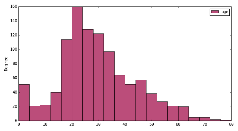
How are ages distributed?
Choose histogram in the plot options and Apply. Then click on the age column (clicking the header chooses all rows unless you have selected rows inside the table). Then press the plot button on the toolbar. You will see this histogram:
Say you want to break down the age distributions by another column representing some categories like sex. Select the age and sex columns by ctrl clicking in the header and then re-plot. The plot should look like this:
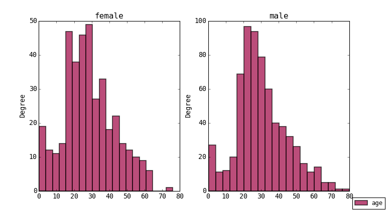
You can do the same for survived and other categorical columns. Remember if you try to group by a numerical column it probably won’t make sense and there will be too many plots to draw. Also when plotting the program tries to plot any number data in your selection so you may need to be careful which columns you have selected to get clear plots.
Breakdown data using value_counts or aggregate
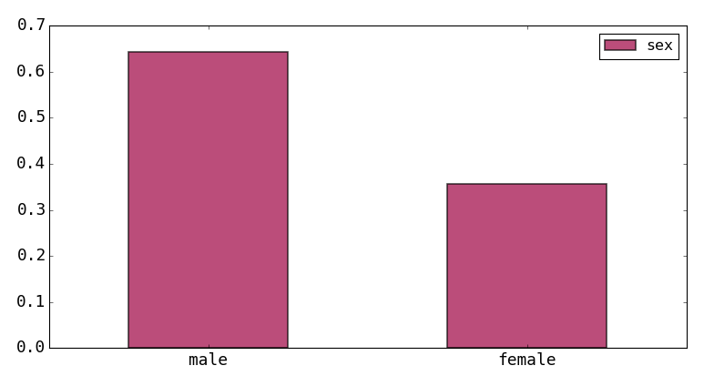
Another way to look at categorical summaries is to use value_counts. This function is applied to a column by right-clikcing in the column header and choosing ‘Apply Function’, then choose ‘value_counts’ as the function. Press OK and some parameters from the function are shown. The defaults are ok, but as an example you could choose ‘normalize’ to get category counts as fractions of the total. The results are opened in a new table below the main one. In this case with just 2 rows. You can select these and plot them as a bar chart:
The above can only apply to one column at a time. To get a more detailed breakdown we want to group by multiple columns. This is done with the aggregate function. Choose the button on the toolbar and you will get the dialog shown below:

We want to group by sex, survival and pclass which are all related factors. So select these columns in the top listbox and then choose and another column e.g. ‘embarked’ as the counting column. Finally select ‘count’ in the functions list then Apply. A new aggregated table is created as shown below.

This table has several indexes representing the grouped columns with the counts for each multiindex. Now we can plot the data in more detail. To do this you can just select all rows and plot but you will get a plot like the one below which is not particularly helpful: (We use barh plot here)

It would be better to have the plots grouped by category. To do this we reset the row index and convert them to normal columns. Do this by right-clicking on the row header and choosing ‘reset index’. You can also flatten the column index for embarked count so it just has one name. Now it looks like a normal table where you can select multiple columns as above and choose grouping in the plot options. If you select sex,count and group by sex you will get the following:

Better, but we still don’t have a breakdown of who survived. To add this we set the survived column as the row index. We can also include the pclass data and use this as the secondary groupby. When we re-plot we get this result:

This is more informative. As you can see the index is important for labeling of the x-axis. The same table can be manipulated in other ways to get different representations. It is recommended to try a few ways until you get the most appropriate view of the data.
In Pandas such aggregation operations are referred to as ‘split-apply-combine’. See this link to learn more.
Re-binning pclass
As a last example say we want to reduce many categories into a few to make things clearer. For example pclass represent the passenger class as 1,2,3 but we want to lump 2 and 3 together as high and the remainder as low. We can do this from the ‘create categorical’ function accessed by clicking on the column pclass header. We then re-bin the column and indicate the new labels. This might take some practice to use properly in other situations. The bins define the bin edges in which to re allocate the data and hence are intervals. So the labels are 1 less than the bins. Bins can also be an integer of equally spaced values. In this case we enter 0,1,3 and low,high as below:

This means any values between 0 and 1 -> low and between 1 and 3 -> high. This creates a new column called ‘pclass_binned’ (you can rename it). You should perform this on the original table (rather than the aggregated one) so the grouping can be redone and then repeat the above steps.
Which families lost the most members
This is a specific kind of question that requires you to think a bit about the steps required. In this case it’s accomplished quite easily with several steps. There may be more than one way to approach such a task.
- Extract the family name from the name field. Right click the header and choose ‘String operation’. Then pick ‘split’ as the function. The separator is a comma by default. Then click ok, this produces 2 new columns called name_0 and name_1. The first is the surname. You can rename it.
- We then simply filter the table to find only those who did not survive. Choose the ‘filter table’ button on the toolbar and enter
survived == 0in the filter bar and press enter. This gives us the 809 individuals who died. - Then apply value counts as above to the surname column. Sort the new table in descending order and if you plot the first 10 rows you will see this result:

The Sage family had the highest loss. In fact this entire family lost their lives.