COVID-19 ECDC data dashboard with Panel
Background
In the previous post we made a simple Bokeh plot of the ECDC data using a javascript callack so that the plot can be embedded. To make more complex dashboards, it’s easier to use Bokeh and Panel with Python functions as callbacks. Though these applications need to be run on a server with a Python backend. This post shows how to make a Panel (PyViz) app running on a self hosted server. You could also use Heroku to deploy this app.
If you want to just try the dashboard, it can be accessed here.
The complete Python script with this code can be found here
Imports
import pandas as pd
import numpy as np
from bokeh.models import ColumnDataSource, GeoJSONDataSource, ColorBar, HoverTool, Legend, LogColorMapper, ColorBar
from bokeh.plotting import figure
from bokeh.palettes import brewer
from bokeh.layouts import row, column, gridplot
from bokeh.models import CustomJS, Select, MultiSelect, Plot, LinearAxis, Range1d, DatetimeTickFormatter
from bokeh.models.glyphs import Line, MultiLine
from bokeh.palettes import Category10
output_notebook()
#output_file('test.html')
import panel as pn
import panel.widgets as pnw
pn.extension()
import geopandas as gpd
import json
Get the data
We fetch the data as shown previously. The same code is used here in a function. We also get a summary of the dataframe for later use.
def get_data():
    df = pd.read_excel('https://www.ecdc.europa.eu/sites/default/files/documents/COVID-19-geographic-disbtribution-worldwide.xlsx')
    df['dateRep'] = pd.to_datetime(df.dateRep, infer_datetime_format=True)
    df = df.sort_values(['countriesAndTerritories','dateRep'])
    #find cumulative cases in each country by using groupby-apply
    df['totalcases'] = df.groupby(['countriesAndTerritories'])['cases'].apply(lambda x: x.cumsum())
    df['totaldeaths'] = df.groupby(['countriesAndTerritories'])['deaths'].apply(lambda x: x.cumsum())
    df['countriesAndTerritories'] = df.countriesAndTerritories.str.replace('_',' ')
    return df

df = get_data()
#pivot table
data = pd.pivot_table(df,index='dateRep',columns='countriesAndTerritories',values='totalcases').reset_index()
#get summary
summary = df.groupby('countriesAndTerritories')\
            .agg({'deaths':np.sum,'cases':np.sum,'popData2018':np.mean})\
            .reset_index().sort_values('cases',ascending=False)
summary['ratio'] = summary.deaths/summary.cases
Make a map
Here we use geopandas to load a world map from a shapefile. The geodataframe is merged with the ECDC data on country name.
def get_geodata():
    shapefile = 'ne_110m_admin_0_countries.shp'
    #Read shapefile using Geopandas
    gdf = gpd.read_file(shapefile)[['ADMIN', 'ADM0_A3', 'geometry']]
    #Rename columns.
    gdf.columns = ['country', 'country_code', 'geometry']
    gdf = gdf.drop(gdf.index[159])
    return gdf

def get_geodatasource(gdf):
    """Get getjsondatasource from geopandas object"""
    json_data = json.dumps(json.loads(gdf.to_json()))
    return GeoJSONDataSource(geojson = json_data)

def bokeh_plot_map(gdf, column=None, title=''):
    """Plot bokeh map from GeoJSONDataSource """

    geosource = get_geodatasource(gdf)
    palette = brewer['OrRd'][8]
    palette = palette[::-1]
    vals = gdf[column]
    columns = ['cases','deaths','ratio','popData2018','countriesAndTerritories']
    x = [(i, "@%s" %i) for i in columns]
    hover = HoverTool(
        tooltips=x, point_policy='follow_mouse')
    #Instantiate LinearColorMapper that linearly maps numbers in a range, into a sequence of colors.
    color_mapper = LogColorMapper(palette = palette, low = vals.min(), high = vals.max())
    #color_bar = ColorBar(color_mapper=color_mapper, label_standoff=8, width=500, height=20,
    #                     location=(0,0), orientation='horizontal')

    tools = ['wheel_zoom,pan,reset',hover]
    p = figure(title = title, plot_height=400 , plot_width=950, toolbar_location='right', tools=tools)
    p.xgrid.grid_line_color = None
    p.ygrid.grid_line_color = None
    #Add patch renderer to figure
    p.patches('xs','ys', source=geosource, fill_alpha=1, line_width=0.5, line_color='black',
              fill_color={'field' :column , 'transform': color_mapper})
    #Specify figure layout.
    #p.add_layout(color_bar, 'below')
    p.toolbar.logo = None
    return p
The data plots
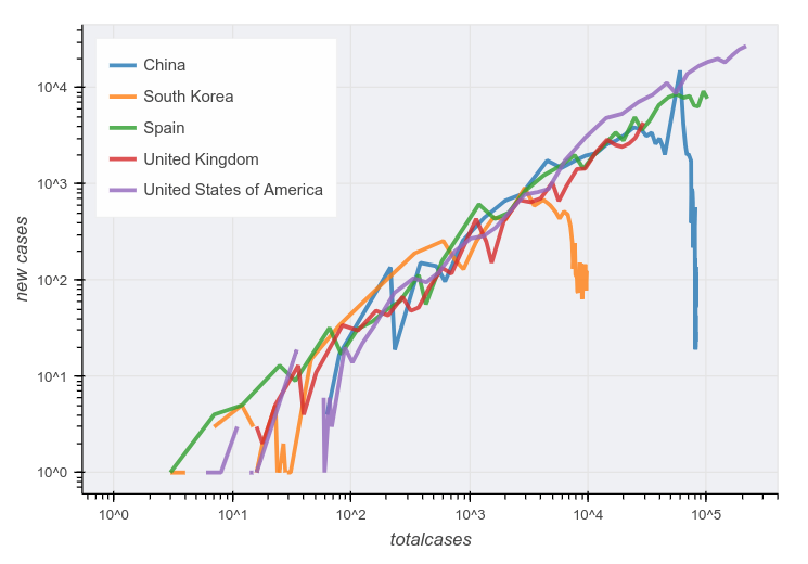
This function plots time series of total, new cases and deaths vs date. It also includes a plot of total vs new cases as suggested here. It uses the country_select menu values defined below to specify which countries to plot.
def bokeh_plot_cases(event):
    """Plot cases per country"""

    countries = country_select.value[:10]
    scale = scale_select.value
    value = plot_select.value
    index = 'dateRep'
    axtype = 'datetime'
    colors = Category10[10] + Category10[10]
    items=[]
    if value == 'total vs cases':
        index = 'totalcases'
        value = 'cases'
        x = df[df.countriesAndTerritories.isin(countries)]
        p = figure(plot_width=600,plot_height=500,
               y_axis_type='log',x_axis_type='log',
               tools=[])
        i=0
        for c,g in x.groupby('countriesAndTerritories'):
            source = ColumnDataSource(g)
            line = Line(x='totalcases',y='cases', line_color=colors[i],line_width=3,line_alpha=.8,name='x')
            glyph = p.add_glyph(source, line)
            i+=1
            items.append((c,[glyph]))
    else:
        data = pd.pivot_table(df,index=index,columns='countriesAndTerritories',values=value).reset_index()
        source = ColumnDataSource(data)
        i=0
        p = figure(plot_width=600,plot_height=500,x_axis_type=axtype,
                   y_axis_type=scale,
                   tools=[])
        for c in countries:
            line = Line(x=index,y=c, line_color=colors[i],line_width=3,line_alpha=.8,name=c)
            glyph = p.add_glyph(source, line)
            i+=1
            items.append((c,[glyph]))

    p.xaxis.axis_label = index
    p.yaxis.axis_label = value
    p.add_layout(Legend(
                location="top_left",
                items=items))
    p.background_fill_color = "#e1e1ea"
    p.background_fill_alpha = 0.5
    p.legend.location = "top_left"
    p.legend.label_text_font_size = "9pt"
    p.toolbar.logo = None
    plot_pane.object = p
    return

def summary_plot(event=None):
    """Plot summary"""

    scale = scale_select.value
    #top 12 countries
    x = summary[:12]
    hover = HoverTool(tooltips=[
                ('Cases', '@cases'),
                ('Deaths', '@deaths')]
            )
    p = figure(plot_width=300,plot_height=500, x_range=list(x.countriesAndTerritories),
               #y_range=(0.1,max(summary.cases)),
               y_axis_type=scale, title='Total', tools=[hover])

    source = ColumnDataSource(summary)
    p.vbar(x='countriesAndTerritories', top='cases', bottom=0.01, width=0.9, source=source)
    p.xaxis.major_label_orientation = 45
    p.background_fill_color = "#e1e1ea"
    p.toolbar.logo = None
    summary_pane.object = p
    return
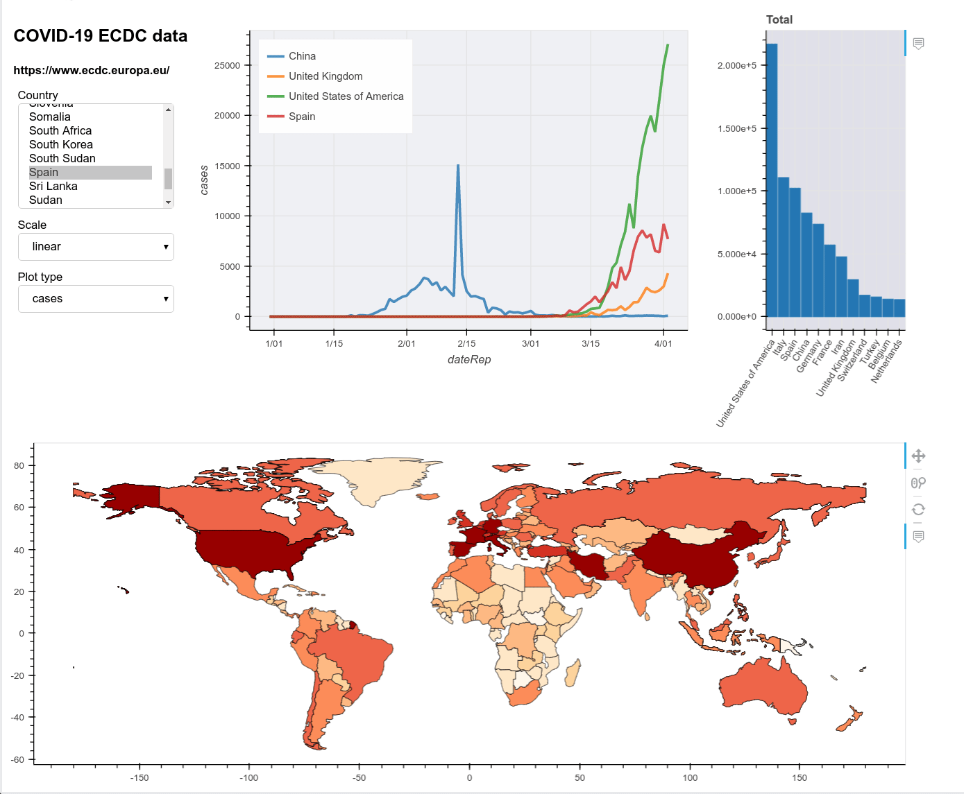
The dashboard
Finally the plots can be put together as one Panel app. We define dropdown menus for country selection and options. These are attached to the the plot functions using the param.watch method of the widgets. The plot functions then update the pane the plot appears in.
common=['China','United Kingdom','United States of America','Spain','Italy',
           'Germany','France','Iran','Australia','Ireland','Sweden','Belgium','Turkey','India']

names = list(df.countriesAndTerritories.unique() )
country_select = pnw.MultiSelect(name="Country", value=common[:4], height=140, options=names, width=180)
country_select.param.watch(bokeh_plot_cases, 'value')
scale_select = pnw.Select(name="Scale", value='linear', options=['linear','log'], width=180)
scale_select.param.watch(bokeh_plot_cases, 'value')
plot_select = pnw.Select(name="Plot type", value='cases', options=['cases','totalcases','deaths','totaldeaths','total vs cases'], width=180)
plot_select.param.watch(bokeh_plot_cases, 'value')

plot_pane = pn.pane.Bokeh()
plot = bokeh_plot_cases(None)
summary_pane = pn.pane.Bokeh()
summary_plot()
scale_select.param.watch(summary_plot, 'value')
map_pane = pn.pane.Bokeh(mp,sizing_mode='stretch_width')

title = pn.pane.HTML('<h2>COVID-19 ECDC data</h2><b>https://www.ecdc.europa.eu/</b>')
app = pn.Column(pn.Row(pn.Column(title,country_select,scale_select,plot_select),plot_pane,summary_pane), map_pane)
Run the server locally
You can either use a Jupyter notebook or save this code in a Python script. In either you need to append this line:
app.servable()
This allows you to run the panel serve script from the command line as below. This runs a local bokeh server so that you can view the dashboard in a browser.
panel serve ecdc_covid19_plots.ipynb --port 5100
The final dashboard looks like this:
Deploy on Apache
Say we wish to share this application beyond a local network. One way is to run the server locally as above and then proxy connections to it through a public facing web server like Apache. The general instructions are here. I got this working by making a static folder under /var/www and placing the bokeh and panel resource files here by copying them from their python package folders under /usr/local/lib/python-*/... Thus getting a directory structure like this:
├── extensions
│   └── panel
│       ├── panel.js
│       └── panel.min.js
└── js
    ├── bokeh-api.js
    ├── bokeh-api.legacy.js
    ├── bokeh-api.legacy.min.js
    .
    .
You then simply alias this folder to /static in the Apache configuration. The restart apache and the page will be viewable fro myour website under whatever name you proxied your local server too.