Ireland COVID-19 trend in positive rate
Background
Irelands Covid-19 2020 outbreak has led to 1,775 official total deaths (HPSC data) with 27,499 positive tests. The first case identified was on 29 February and first identified fatality was on 11 March. Since then, like most European countries, Ireland has been in a delaying phase with varying degrees of restrictions. Some of these have been lifted gradually but the policy remains one of suppression. Therefore any spikes in detected cases are met with alarm. Increases in test positives in August were largely caused by localised clusters, some located in meat factories. In response, on August 7 the government locked down three counties containing these clusters. On 18 August, the government announced six new measures that again restrict gatherings. These responses are centred on a policy of complete suppression which will have to continue indefinitely according to the current logic, as long as the virus circulates and is tested for.
The data used here is provided at data.gov.ie. The plots below can be updated at any time by downloading the notebook and running it locally.
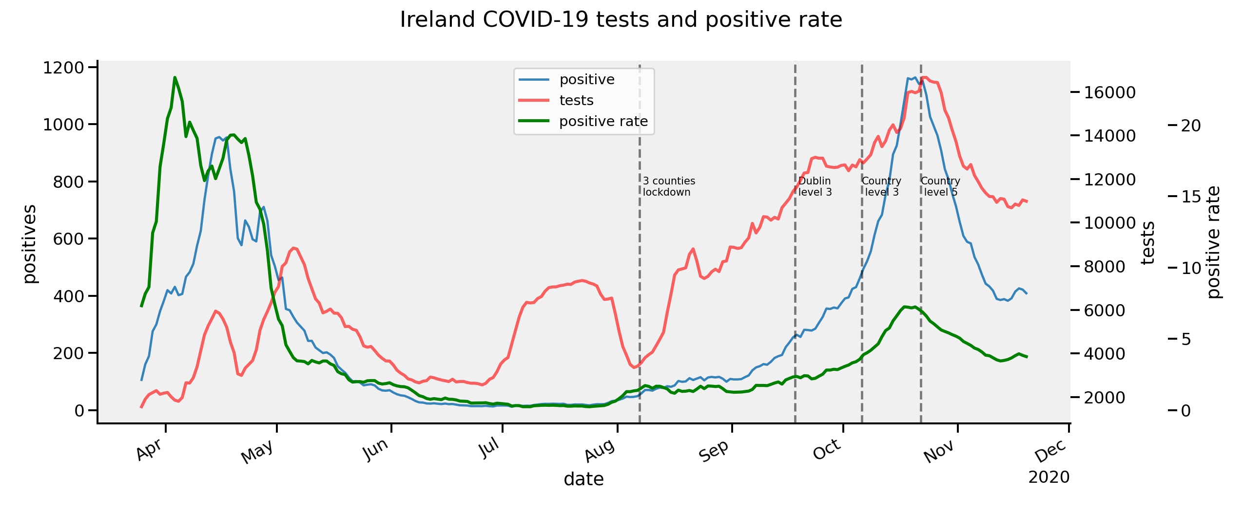
Tests performed vs positive rates
Note: Plots updated subsequent to writing this post to reflect more recent data.
With any ongoing transmission of a virus, continual community testing will eventually reveal some clusters. Many will go likely go undetected and may not spread if sufficient immunity exists or if distancing measures prevent it (or both). If we plot the tests performed and actual positives we can see the rate (positives/total tests) has steadily declined since May. (The data is plotted here as a rolling mean with 7 day window to smooth the curves). This is despite the gradual re-opening. Tests have increased rapidly again in August in response to the clusters with contact tracing allowing other cases to be discovered. Thus by definition more cases are found in these areas. Such fluctuations are inevitable and a result of testing and tracing. However the total positive rate continues downward.
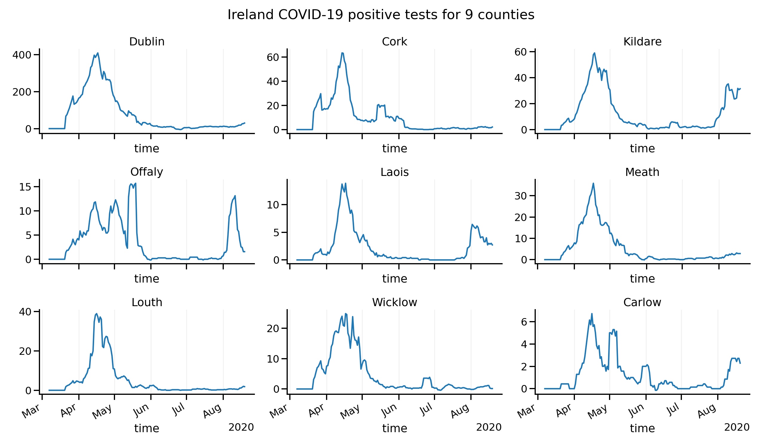
Per county positives
The by-county nature of the new cases can be seen in these plots (Covid19CountyStatisticsHPSCIreland dataset). The three counties of interest show spikes but whether they are in clusters (they largely were) can’t be seen in these plots.
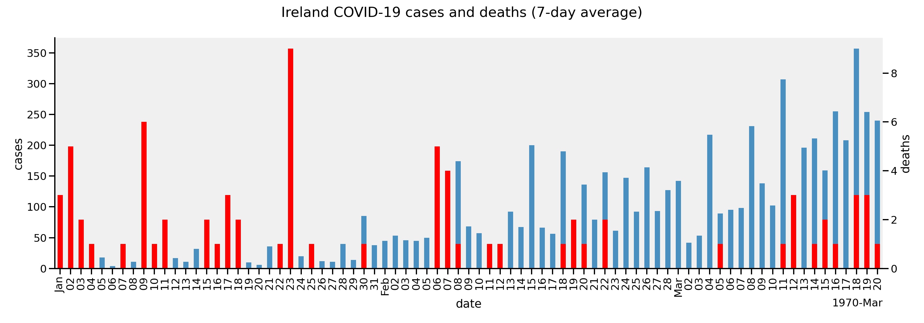
Deaths and hospitalisations
As we can see these two metrics have remained flat despite rises in confirmed cases.
How to respond to spikes in test positives?
The reporting of cases due to positive tests without reference to localisation, symptomatic status, age group and testing numbers is not very helpful. HPSC does produce epidemiology reports which have some more detail but few will read them. Unfortunately, details matter. For example, the majority of cases in August have been in people under the age of 45. Many cases have been due to obvious clusters probably where repeated transmissions occur within groups as in the meat plants. The public health response appears bizarre in this context. If these known locations can be monitored and restrictions placed there in the short term, what is the purpose of regional ‘lockdowns’?