Example: plotting miRNA abundance data (advanced)
Background
microRNAs (miRNAs) are non-coding RNAs that have been shown to be important in regulating gene expression. They have significant potential as novel biomarkers for a range of human diseases. This example uses RNA-sequencing results of serum miRNA from an experimental paratuberculosis infection model in cows. The data file is a set of abundances of cattle miRNAs over 24 samples representing 12 different animals. This data file was produced from the raw miRNAseq data using the miRDeep2 software.
Viewing the miRNA abundance data
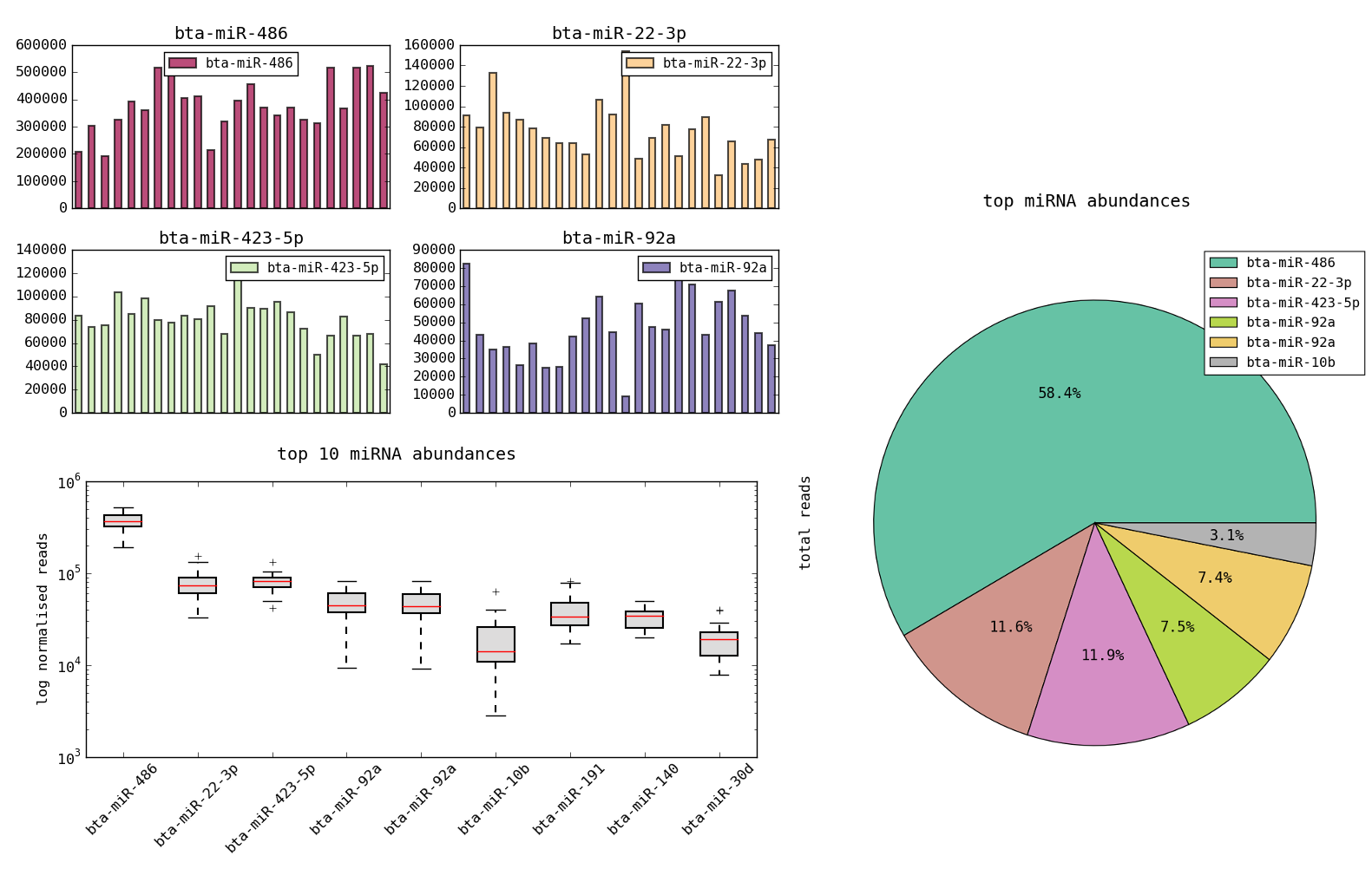
Load the dataset using Datasets->miRNA expression. You can see that there is one row per miRNA and columns of read counts for each of the 24 samples labelled s01, s02 etc. There are also columns called s01(norm) etc. which are the normalized counts. First let’s look at ways in which the data can be viewed using just the regular plotting functionality. We wish to see sample variation for a single miRNA. This can be done by simply selecting a row and then plotting a bar graph. You will get a result like the plots below:

However to better represent distributions over multiple samples it is better to have the samples in rows and miRNAs in columns. That is we should transpose the table. Before this we set the miRNA name field as the index, so that the column names will be meaningful. Then use the transpose button on the toolbar. This can be reversed by pressing the button again. After transposing the rows and columns are switched. You can view the row index by right-clicking on the row header and using ‘toggle index’. The table should appear as below.
Now selecting the normalized rows and a number of miRNA columns (using ctrl-click in the header) will allow us to view distributions over multiple miRNAs. We can get more meaningful summaries this way such as the three examples below. You can figure out how to create these by playing with the plot options.
Adding per sample labels
The 24 samples in this dataset come from 12 animals, 6 control and 6 infected and at 2 time points. What we really want is to see the differences between these conditions. However this information is in another table matching the sample names to the categories. This file is provided here as a csv file. To put it into dataexplore just open it in a text editor or spreadsheet, copy and then create a new sheet and paste it in. You can also use the import csv dialog but it shouldn’t be needed. The table is of the following form:
| animal | month | status | id | |
|---|---|---|---|---|
| 0 | 2401 | 6 | control | s11 |
| 1 | 2402 | 0 | infected | s17 |
| 2 | 2215 | 6 | control | s18 |
| 3 | 2409 | 0 | control | s19 |
| 4 | 2390 | 0 | infected | s20 |
Download the table here.
Combining multiple sample labels with miRNA expression data
We now want to add the sample labels to the data before we can plot. This means merging the 2 tables. We want to use the factor plotting plugin to view the data so first we will ‘melt’ the miRNA table and then merge, finally we can plot. The steps are given below.
- create a new sheet and copy/paste the mirna table into it.
- remove the un-normalized columns s0* (shift-click from s01-s24 and then right click in header to choose ‘delete columns’)
- melt the mirna table using all s* cols as value vars and #miRNA field as id var. Your data is now in long form and will have 10,058 rows.
- rename the var column to remove the ‘(norm)’ part, so that they can be matched to the ‘id’ column of the labels. You can do this by right clicking on the column header and choosing ‘string operation’. Then select function replace and enter ‘(norm)’ in the pattern box. (The \ characters are added to escape the brackets). replace with should be empty, then press OK.
- make a new sub-table. copy and paste the sample labels into the sub-table
- open the merge dialog and merge with left=’var’ and right=’id’ using how=’inner’. you will be asked to overwrite the table, say yes.
- you now have a long form table with the sample labels, as shown below:
| #miRNA | var | value | animal | month | status | id | |
|---|---|---|---|---|---|---|---|
| 0 | bta-miR-486 | s01 | 208689.43 | 2389 | 6 | control | s01 |
| 1 | bta-miR-22-3p | s01 | 91320.37 | 2389 | 6 | control | s01 |
| 2 | bta-miR-423-5p | s01 | 83611.02 | 2389 | 6 | control | s01 |
| 3 | bta-miR-92a | s01 | 82393.76 | 2389 | 6 | control | s01 |
| 4 | bta-miR-92a | s01 | 81839.03 | 2389 | 6 | control | s01 |
| 5 | bta-miR-10b | s01 | 40287.36 | 2389 | 6 | control | s01 |
| 6 | bta-miR-191 | s01 | 36031.83 | 2389 | 6 | control | s01 |
| 7 | bta-miR-140 | s01 | 35359.5 | 2389 | 6 | control | s01 |
Using the factor plotting plugin with the long form data
See the previous post for introduction to factor plots.
Open the factor plots plugin which handles long form data. Tick the checkbox ‘convert to long form’ off since the data is already in that format. You can now group plots by the label categories such as ‘animal’, ‘month’ and ‘status’.
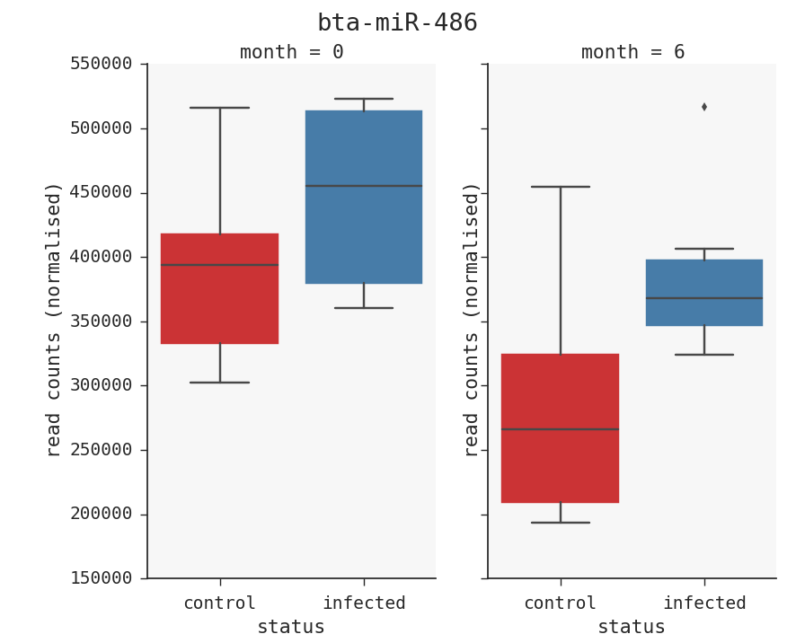
As an example say we want to see the top miRNA, bta-miR-486 with infected vs control at both time points. There is one more step we need to do that. We have to filter the table to get only that miRNA. Click on the ‘filter table’ button in the toolbar. The enter this string: ‘miRNA==”bta-miR-486”’. Press enter and you will get a subset of the data you want to plot. Then choose col=’month’ and x=’status’ and kind=’box’. This will give you the plot below.
The above may seem quite complicated but will become easier as you get used to the program and as some of these features are improved.
Links
Reference
D. Farrell, R. G. Shaughnessy, L. Britton, D. E. MacHugh, B. Markey, and S. V. Gordon, “The Identification of Circulating MiRNA in Bovine Serum and Their Potential as Novel Biomarkers of Early Mycobacterium avium subsp paratuberculosis Infection,” PLoS One, vol. 10, no. 7, p. e0134310, 2015