Excess mortality in Ireland is still high in 2022
Background
Please see update for 2023 here.
In a previous post I showed how can use daily deaths from RIP.ie to get up to date mortality estimates in Ireland. This is a useful alternative to official GRO data which lag behind by some months. It is possible to determine sex from the death notices but not age. To summarise, RIP.ie data shows unusually high mortality for 2021/22 which continues to the present (September 2022). Below is an updated plot showing how 2022 values are still trending higher. These are rolling averages of daily deaths to smooth out the trends and make them more readable.
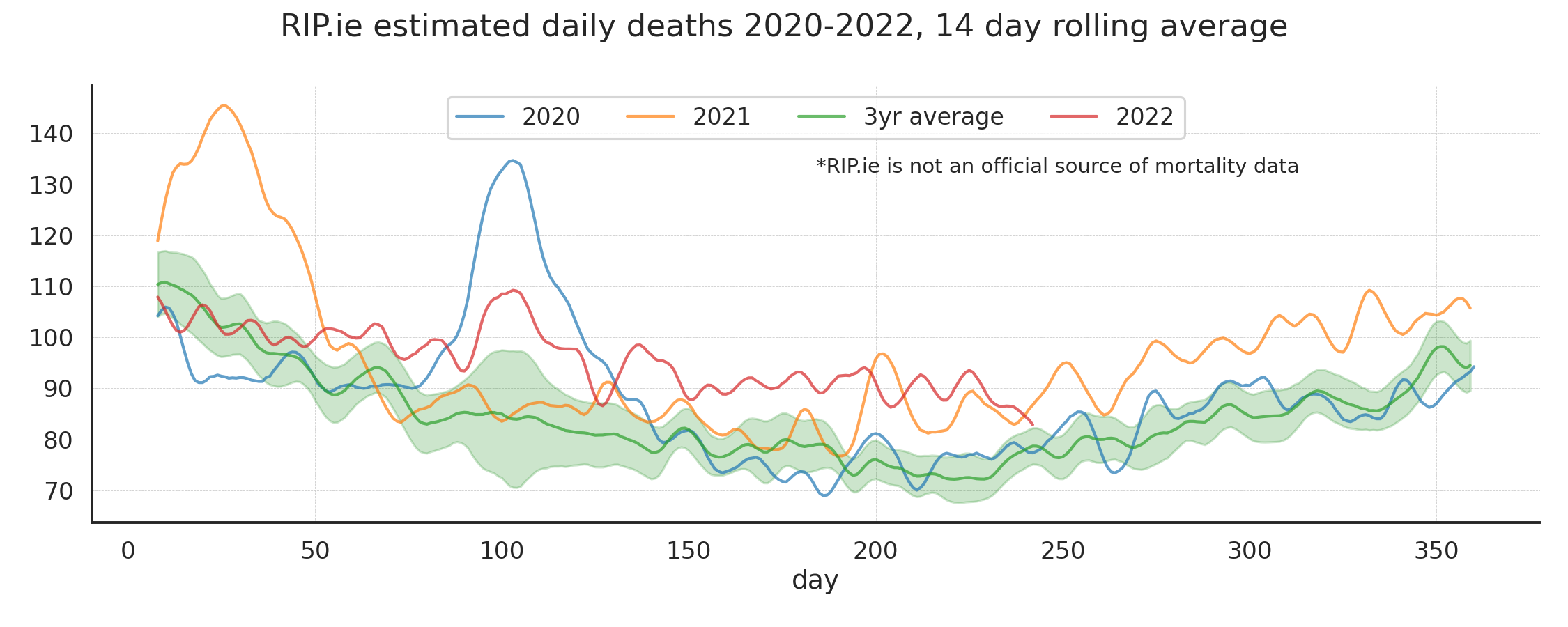
Mean trends in death from RIP.ie. 3 year average is for 2017-2019.
Excess estimation
Mortality is seasonal and cyclical in predictable ways. Such that an unusual event should stand out over a normal year. The primary reason is that deaths peak in Winter largely for older age groups. There are numerous ways to estimate excess deaths over a year or Winter season. The Euromomo method for example estimates z-scores.
Weekly excess
We can get a general picture of excess trends by plotting weekly deaths and calculating the difference for each week compared to the corresponding weekly average over a number of recent years. Here I chose the average of 2017-2019. The orange bars are thus the weekly excess over the average. Negative means values are lower than expected. We can see the two pandemic peaks and then the almost continual excess from mind 2021 onwards. Note we are using absolute numbers and not mortality rates adjusted by population (this has it’s own problems).
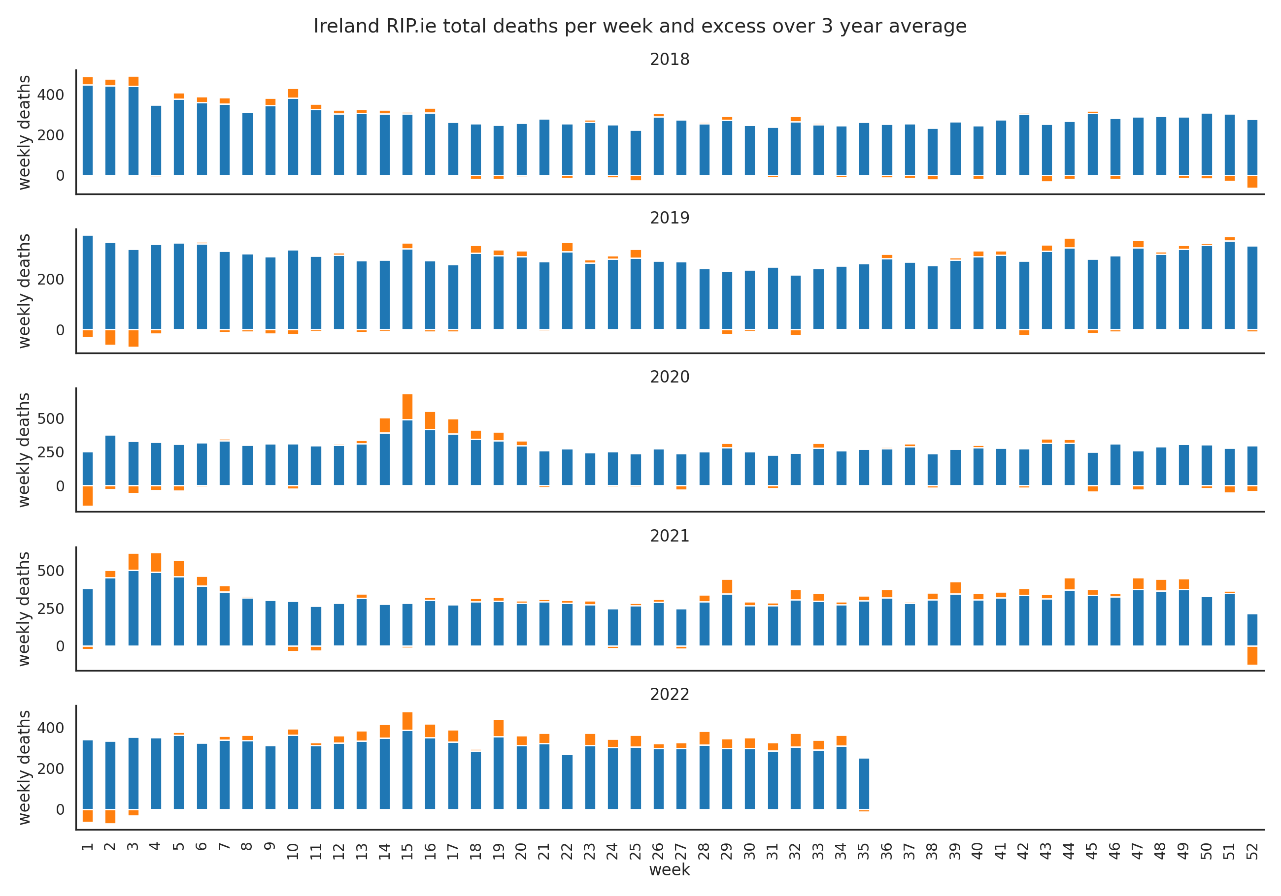
Weekly deaths and excesses over three year average.
This can also be viewed as the percentage difference over the average values as below:

Weekly percentage excesses over three year average.
We can also sum all the weekly excesses for each year:
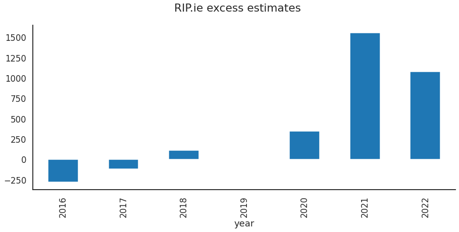
Excess estimates per year summed from weekly values.
Curve fitting
Another very simple method is to fit a line to the summer minima over a number of years to get a baseline level. All deaths over this in a given year can be counted as the total yearly excess. The data highlighted in green in the plot was used to represent the ‘normal’ Summer low. This will incorporate the slowly increasing upward trend in the data that should partly account for population growth, for example. We can see the fitted line indeed trends upwards.
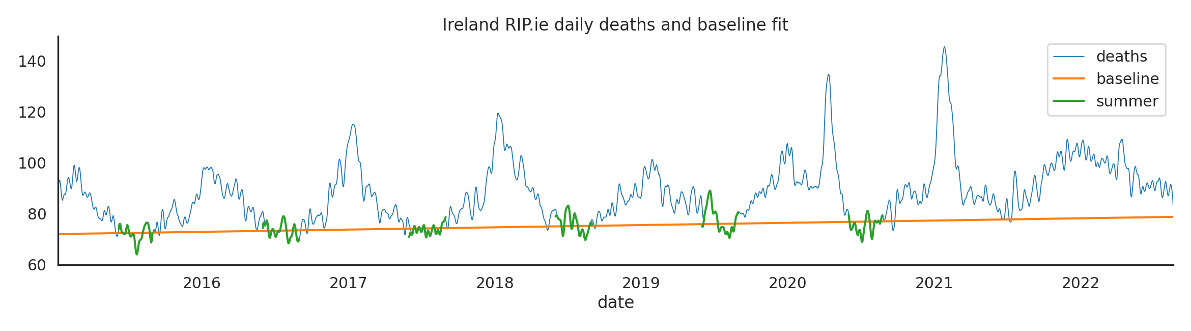
Baseline fit to summer minima.
However this doesn’t give us excesses over the expected Winter peaks. Another way is to fit the data to a periodic sinusoidal function that matches the seasonal changes. Deviations from this over a year/season can be considered the Winter excess. Fitting the following function to the pre-2020 data yields the result below. We can see immediately that the Summer minimum for 2022 is unlike any previous year and stands clearly above the fitted curve.
\[deaths = x + sin(x) + cos(x)\]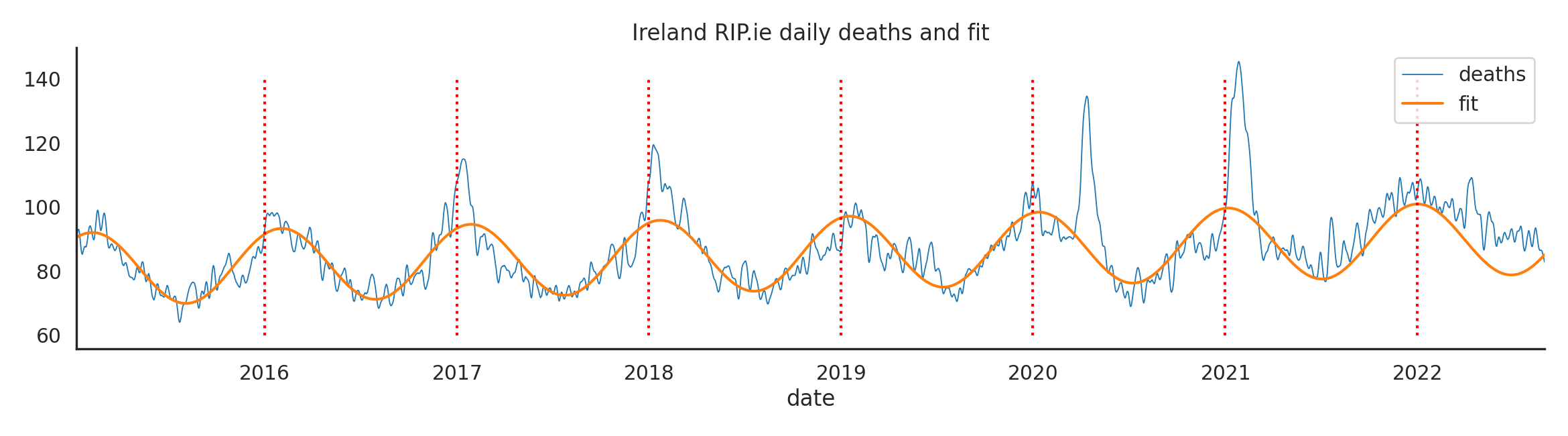
Baseline fit with periodic sine function.
With either method, the total excess for that season is the difference between deaths and baseline function. Using the second method we can calculate the excess for each year or season (June to June). The latter is often used as it covers a single Winter season. The seasonal values are shown on the right plot. The red lines are the average up 2020.

Excess estimates from curve fitting .
I have little experience with time series analysis so I chose to use simple methods I could understand. I do not know which values are the best estimate but the trend is generally the same. Doubtless even more sophisticated methods will show similar results as the signal is so clear. Very likely using population adjusted mortality rates will decrease some of these estimates. This is explained in this Society of Actuaries blogpost. They calculated 4,143 excess for the first 11 months of 2021. This would be lower using their population adjusted 5 year average.
International trends
Ireland is not the only country experiencing high excess mortality rates in the past year. Similar trends are seen in Italy, the US and other countries as shown below. The values are explained in the caption.
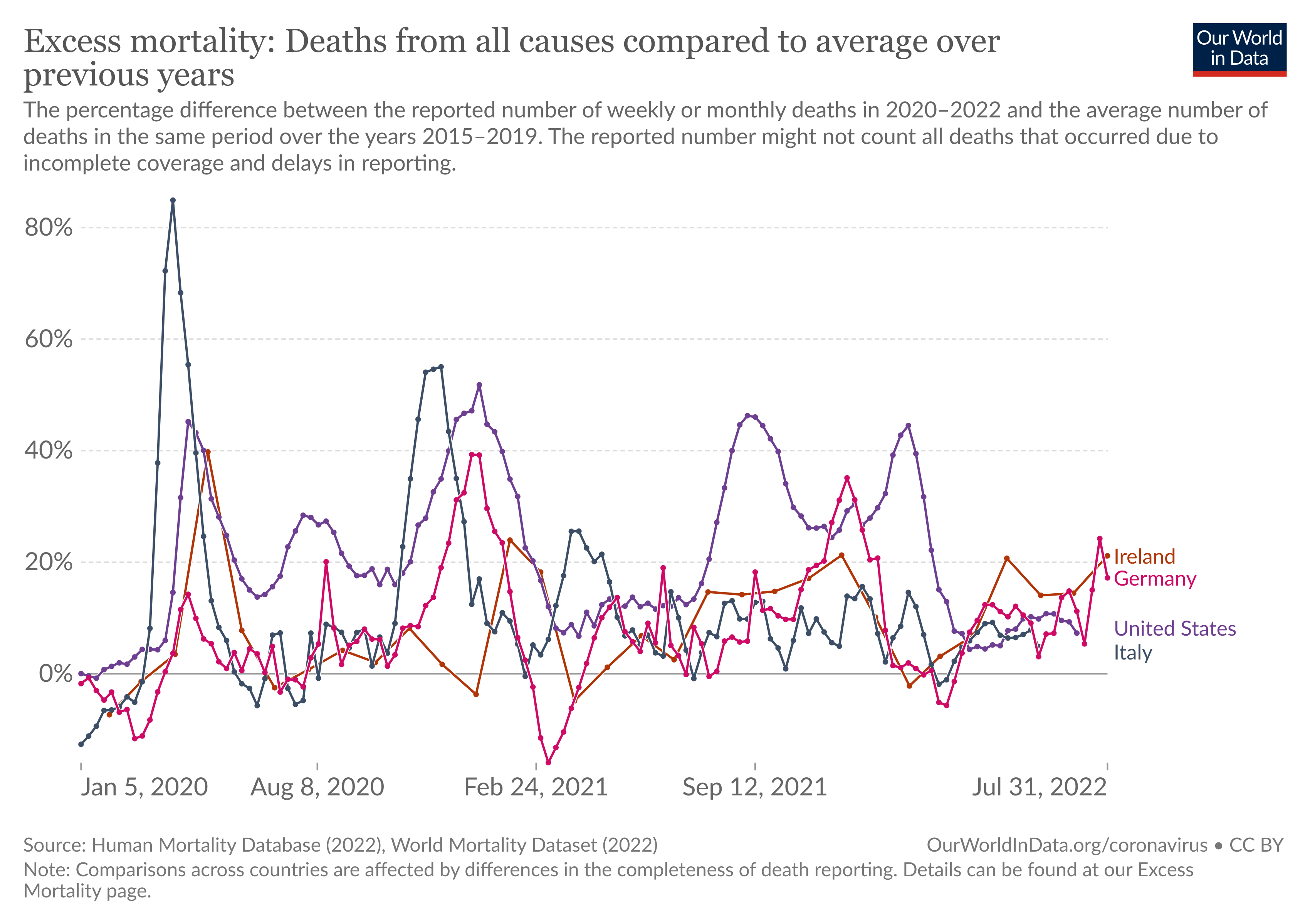
Our world in data mortality excesses for selected countries.
The code for creating these plots can be found in the Jupyter notebook here.