COVID tracking project - tests vs positive rates
Background
The COVID tracking project collates data on COVID-19 testing and deaths across the Unites States and makes this data publicly available. The initiative is designed to help policymakers and the public understand the trajectory of the pandemic. Here are some plots using that dataset along with some simple observations.
Total USA tests/positive rate
Note: Plots updated subsequent to writing this post to reflect more recent data.
We can sum the daily tests and positives over all states to get the trend for the whole US in one plot. perc positives is the percentage of total tests that are positive. It is important to measure the trend in detected positives (green) as a proportion of the amount of testing, rather than total positives (orange). The quoting of positives tests alone, as is often the case in the media, is largely useless from a population perspective. This is especially true when large numbers of tests are being carried out and the prevalance of the disease is low in many areas. It is seen that testing has increased steadily and thus the trend of positives captures many more cases. However positive rates have not increased anywhere near as much.
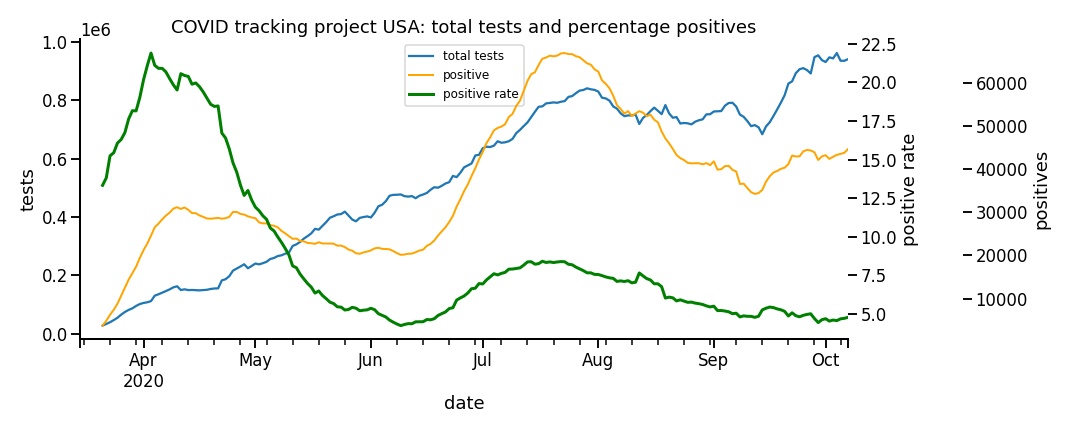
Tests performed vs positive rates
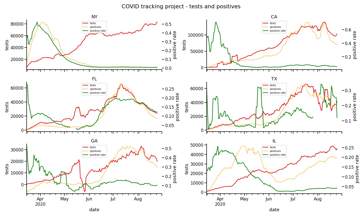
For some significant states we can plot the same data individually. NY: New York, CA: California, FL: FLorida, TX: Texas, IL: Illinois and GA: Georgia. The data has been plotted as a seven day rolling mean to smooth the line plots. Outbreaks have been at different times across the country. The US in this sense may be better seen as a collection of territories than as one homogenous area. Number of tests in New York were low at the peak and the rate was not capturing the true prevalance at all. Now positives are very low since the pandemic has subsided. California shows how postives and testing increase together dramatically but not the rate, which has stayed at lower than 0.1% since May.
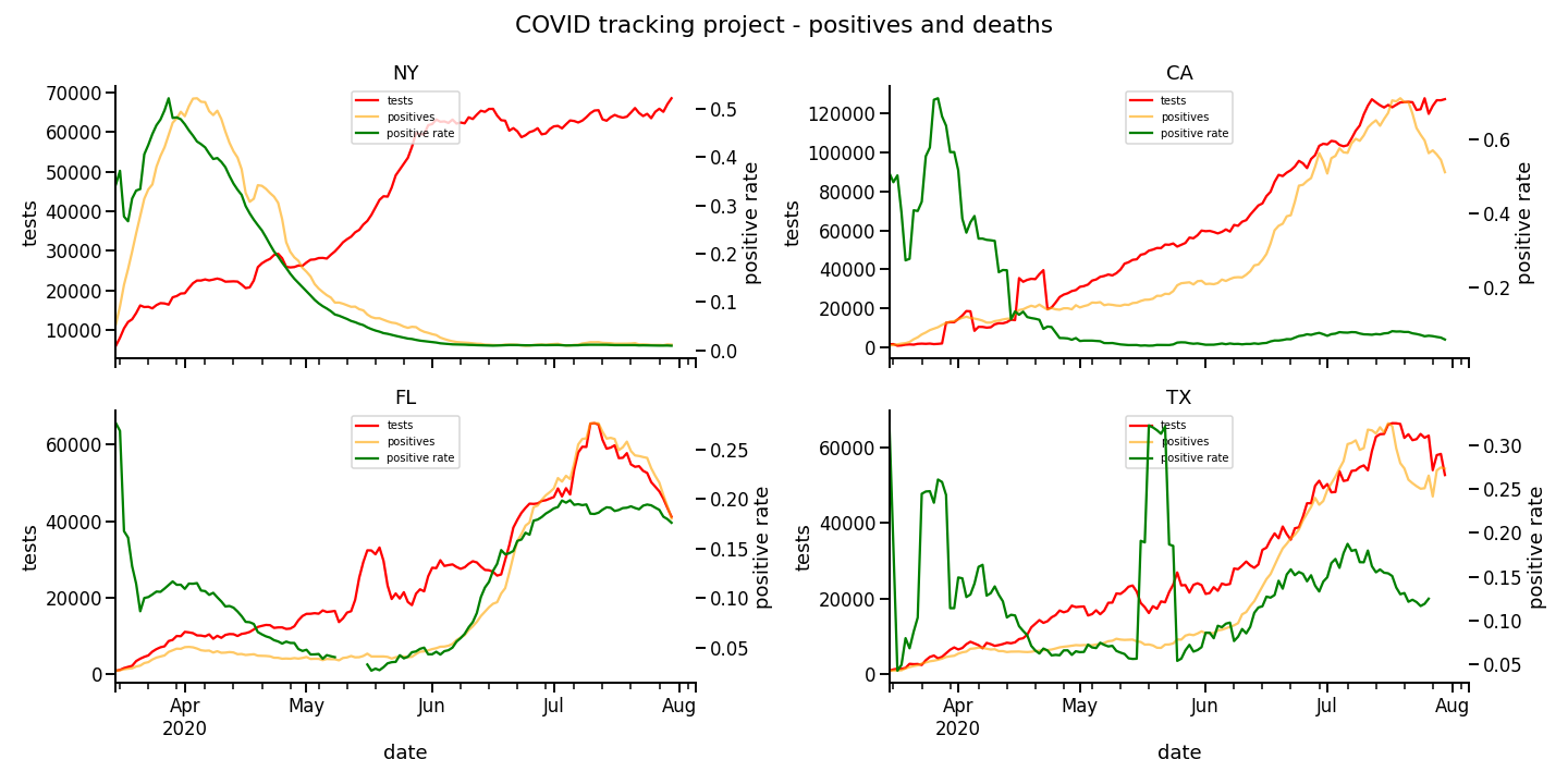
Positive rates and deaths
These plots show the same positive rate this time paired with daily deaths. The trends per state are quite different. We can see the large spike in deaths in New York early on when the virus spread rapidly in vulnerable populations. The more recent increases in deaths in Florida and Texas appear to correlate to some extent with positive rates. Many of these positives were reported to be in younger people. However remember that in the United States to date, at least 42% of all Covid19 deaths are accounted for by 0.6% of the population living in nursing homes. Most of the deaths in Florida and Texas will have been in older age groups also. So there is not a clear correlation between positive rates of detection and deaths as it may appear.
Caution is needed
Much care is needed when interpreting such data and doubtless public health officials know this, or should. The reporting of ‘cases’ regardless of testing numbers is usually misleading but is common in the media and now even by governments.
The jupyter notebook and csv file for making these plots can be found here.