Interactively view datasets with HoloViews
Background
HoloViews is a Python plotting library for web visualization. Unlike other plotting libaries it takes a Declarative approach to plotting. This just means you create and object describing your data and the plots are then just automatic visual representations of this data. Multiple backends are supported like Bokeh and matplotlib. The syntax of making the plot remains the same regardless. There are several ways to get interactive plots with this tool. Here we examine using Panel widgets in conjunction with Holoviews to make quick plots without having to explicitly write custom Bokeh code for plotting. This example uses the Irish property price register dataset that records all property sales in the country from 2010 onwards.
You can run this code yourself in a Jupyter notebook on Binder from here:
Imports
import panel as pn
import panel.widgets as pnw
import holoviews as hv
from holoviews import opts
hv.extension('bokeh','matplotlib')
Code
Here we import the data as a csv file and create a year collumn and convert the dates to datetime objects. We also extract the county and years so they can be used to populate the widgets below.
df = pd.read_csv('PPR-ALL.csv.gz')
#extract year
df['year'] = df.date.str.slice(6,10)
#convert date to datetime
df['datetime'] = pd.to_datetime(df.date)
counties = sorted(list(df.county.unique()))
counties.insert(0,'All')
years = list(df.year.unique().astype(str))
Panel dashboard
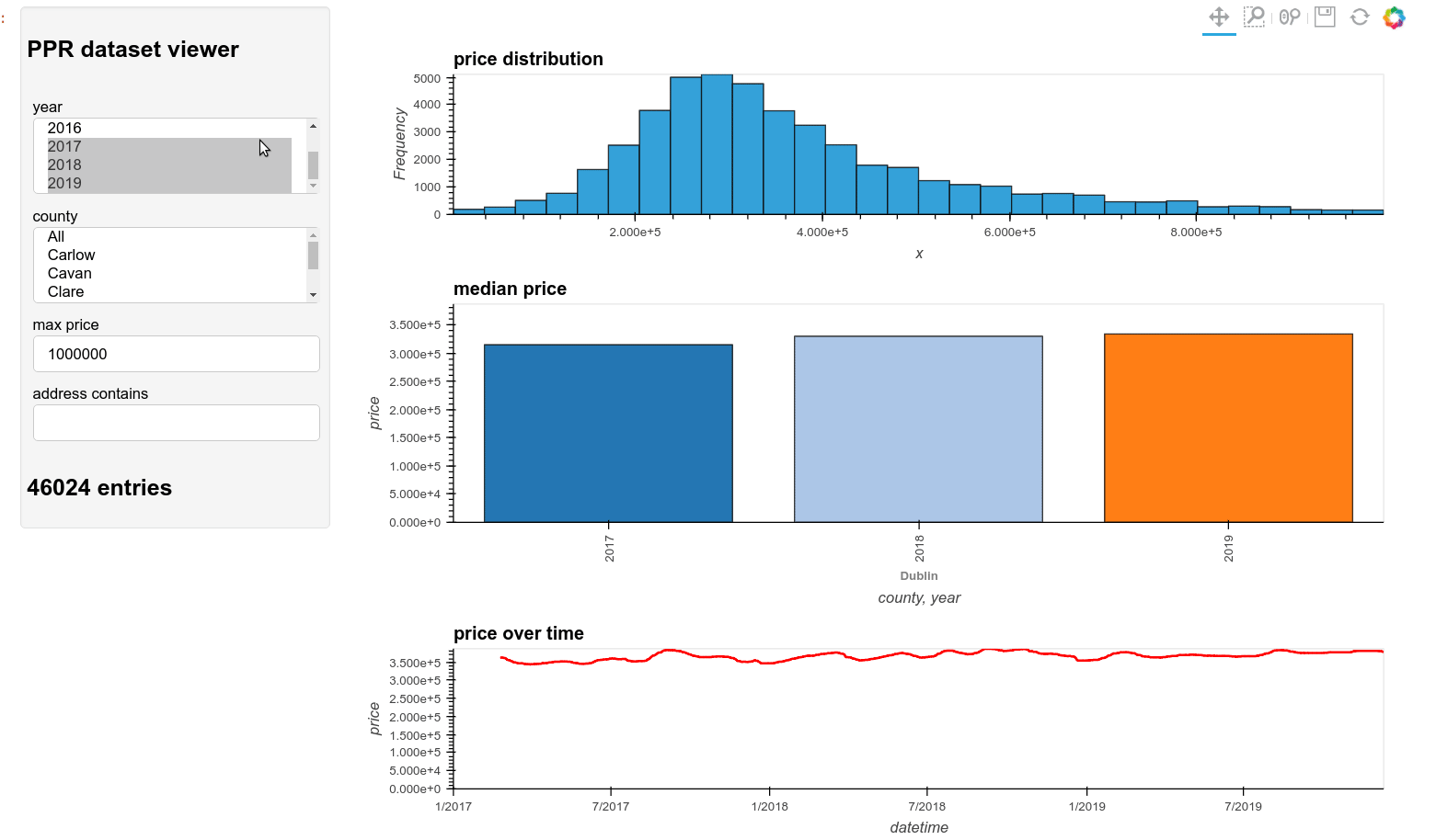
The @pn.depends decorator allows a function to be automatically linked to the widgets we have created. The plots function then just filters the dataframe df according to the parameters and updates eaach time a widget is created. In this case we return 3 plots and a table in a holoviews layout. The table shows the values in that subset up to a limit of 50000.
#create widgets
year_sel = pnw.MultiSelect(name='year',options=years,value=['2019','2018','2017'],width=250)
max_price = pnw.TextInput(name='max price',value='1000000',width=250)
address = pnw.TextInput(name='address contains',value='',width=250)
county_sel = pnw.MultiSelect(name='county',options=counties,value=['Dublin'],width=250)
debug = pn.pane.Markdown()

@pn.depends(year=year_sel.param.value, county=county_sel.param.value,
            price=max_price.param.value, address=address.param.value)
def plots(year=2010,county=None,price=1e6,address=None):

    from holoviews.operation.timeseries import rolling
    from bokeh.models import NumeralTickFormatter
    #df is defined outside the function in the notebook
    x = df
    x = x[x.year.isin(year)]
    x = x[x.price < float(price)]
    if not 'All' in county:
        x = x[x.county.isin(county)]
    if address is not None:
        addr = x.address.str.lower()
        x = x[addr.str.contains(address)]
    x = x.sort_values(by='datetime')

    pricebycounty = x.groupby(['county','year']).agg({'price':[np.median,np.std]}).reset_index()
    pricebycounty.columns = ['county','year','price','std']

    edges, data = np.histogram(x.price,bins=30)
    hist = hv.Histogram((edges, data))

    bars = hv.Bars(pricebycounty, ['county', 'year'], ['price'])
    bars.relabel('Tick formatters').opts(yformatter='%f.0')

    w=int(len(x)/20)
    r = x.set_index('datetime').price.rolling(w, win_type ='triang').mean()
    #smoothed curve
    avg_curve = hv.Curve(r)
    cols = ['datetime','price','address']
    table = hv.Table(x[cols][:50000])
    #put the plots in a holoviews layout
    layout =  hv.Layout(hist + bars + avg_curve + table).cols(1)
    layout.opts(
        opts.Bars(width=900, title='median price', xrotation=90, color=hv.Cycle('Category20')),
        opts.Histogram(height=200, width=900, title='price distribution'),
        opts.Curve(height=200, width=900, title='price over time', color='red'),
        opts.Table(width=900)
    )
    debug.object = '## %s entries' %len(x)
    return layout
Result
The resulting dashboard is shown below. You can interactively try it at the binder link above.