Plotting global sea ice extent data with four different Python packages
Background
This post shows four different libraries for visualizing the same data. The data used here was calculated using raw data provided by NSIDC (the National Snow and Ice Data Center). This combines measures of north and south sea ice extent to estimate the global total. We will plot the data from a pandas dataframe by year with a trendline.
Import data
import pandas as pd
df=pd.read_csv('seaice_extent_cleaned.csv',index_col=0)
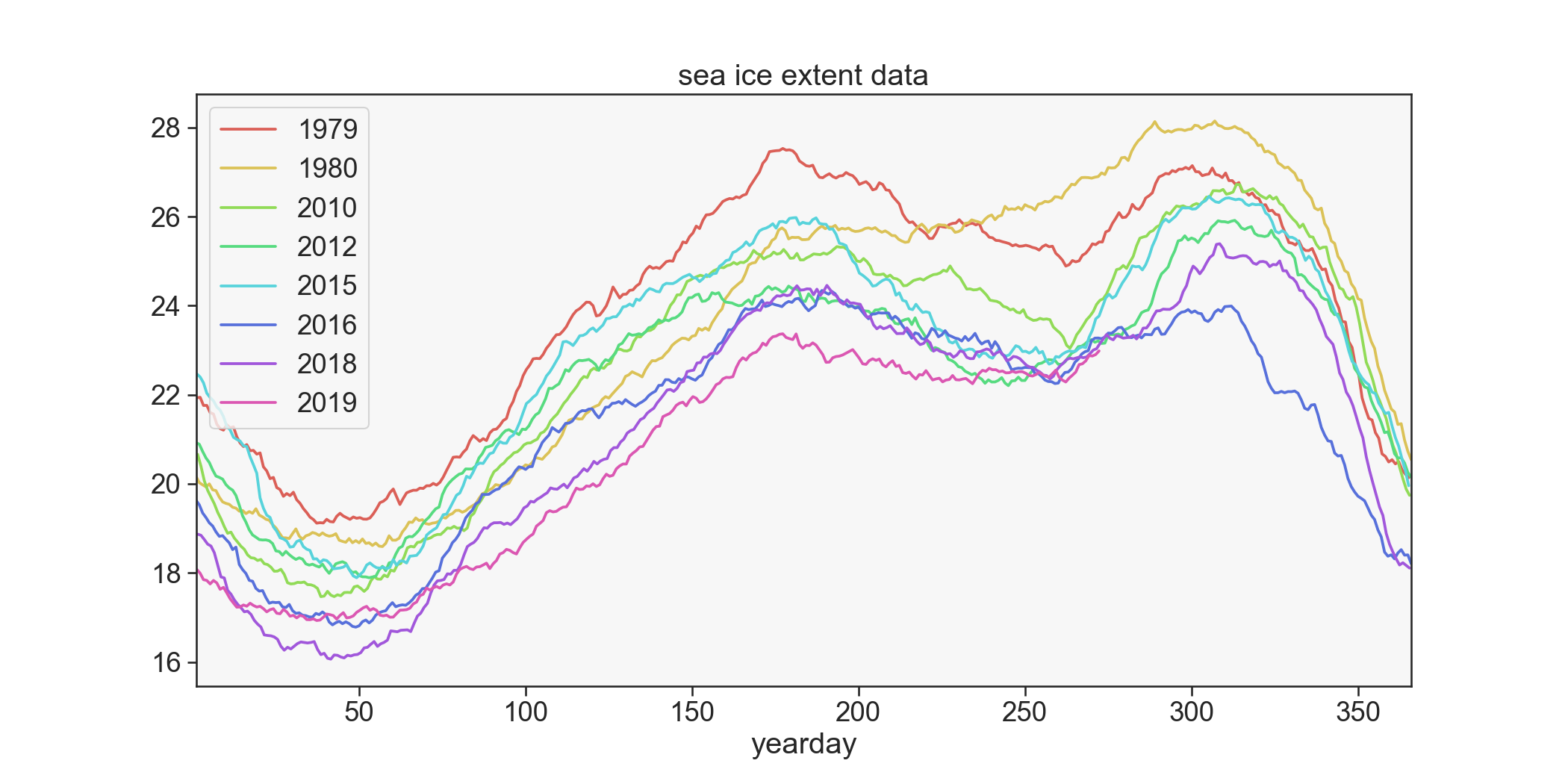
Matplotlib
Matplotlib is the most well established plotting package for Python. It can be used for interactive plots but here we just make a static plot. This is fairly quick and easy once you are used to the API. We just group the dataframe and plot each group on the same axis. seaborn used to make the color palette only and isn’t essential.
import seaborn as sns
years = [1979,1980,2010,2012,2015,2016,2018,2019]
groups = df[df.year.isin(years)].groupby('year')
pal = sns.color_palette("hls", n_colors=len(groups))
fig,axs=plt.subplots(1,1,figsize=(14,7))
i=0
for yr,g in groups:
    g.plot(y='extent',x='yearday',lw=1.8,ax=axs,label=yr,c=pal[i])
    i+=1
plt.title('sea ice extent data')
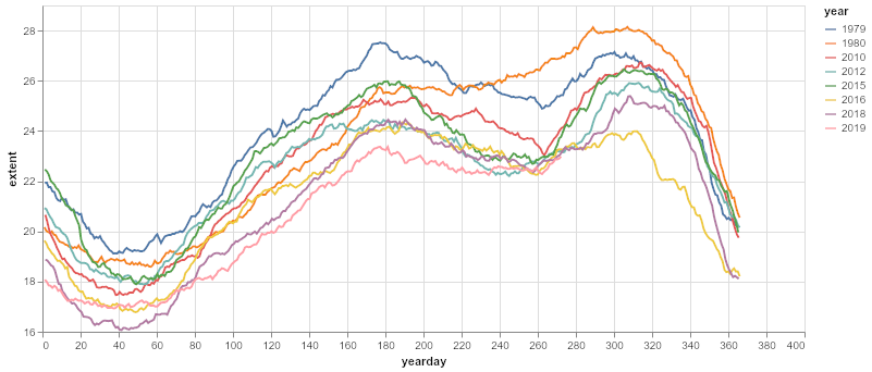
Altair
Altair is a declarative plotting library for Python, based on Vega. That means you describe the properties of the data and the object can plot itself from these properties. It provides some interactivity and the code is quite readable and short.
import altair as alt
sub = df[df['year'].isin(years)]
chart = alt.Chart(sub).mark_line().encode(x='yearday',
                                           y=alt.Y('extent', scale=alt.Scale(zero=False)),
                                           color='year:N',
                                           tooltip=['year', 'extent']
                                         ).properties(width=700, height=300)
chart
Holoviews
Holoviews is ideal for quick web based interactive plots. (It uses Bokeh in the background). Here the DynamicMap function is used. It is a multi-dimensional wrapper around a callable that returns HoloViews objects. It’s a convenient and quick method to make these plots. The code is short, though more complex code is needed for customized plots or interaction.
import holoviews as hv
from holoviews import opts
hv.extension('bokeh','matplotlib')

def get_extent_data(year):
    df = pd.read_csv('seaice_extent_cleaned.csv',index_col=0)
    df = df[df.year==year]
    return hv.Curve(df, 'yearday','extent')

dmap = hv.DynamicMap(get_extent_data, kdims=['year'])
dmap.redim.range(year=(1980,2016))
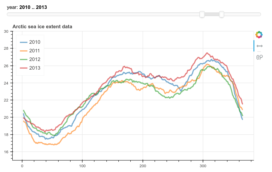
Bokeh and Panel widget
This method produces a more flexible plot with Bokeh and a Panel range slider for choosing the years. In this case the dataframe is pivoted to make a column for each year and then passed to a ColumnDataSource object for bokeh to use. We then add a line plot for each column. The legend had to be added manually. Finally param.watch is used to attach the plotting function to the RangeSlider.
import itertools
import panel as pn
import panel.widgets as pnw
from bokeh.models import ColumnDataSource, HoverTool, Legend
from bokeh.plotting import figure
from bokeh.models.glyphs import Line
from bokeh.palettes import Category10
pn.extension()

year_select = pnw.RangeSlider(name='year',start=1980,end=2019,value=(2010,2013))
plot = pn.pane.Bokeh()

def plot_extent(event):

    years = range(year_select.value[0],year_select.value[1]+1)
    df=pd.read_csv('seaice_extent_cleaned.csv',index_col=0)
    df = df[df.year.isin(years)]
    df['year'] = df.year.astype(str)
    #pivot table to get a column for each year
    data = pd.pivot_table(df,index='yearday',columns='year',values='extent').reset_index()
    #remove nans in data
    data = data.interpolate()[5:]
    source = ColumnDataSource(data)
    p = figure(plot_width=700, plot_height=400, tools=["xpan,xwheel_zoom"])
    years = [str(i) for i in years]
    #make enough colors
    colors = Category10[10] + Category10[10]
    i=0
    items=[]
    for y in years:
        line = Line(x="yearday", y=y, line_color=colors[i], line_width=3, line_alpha=0.6, name=y)
        glyph = p.add_glyph(source, line)
        i+=1
        items.append((y,[glyph]))
    p.y_range.start=15
    p.y_range.end=30
    p.add_layout(Legend(
            location="top_left",
            items=items))
    p.title.text = 'Arctic sea ice extent data'
    plot.object = p
    return

year_select.param.watch(plot_extent, 'value')
year_select.param.trigger('value')
pn.Column(year_select,plot)
The output looks like this:
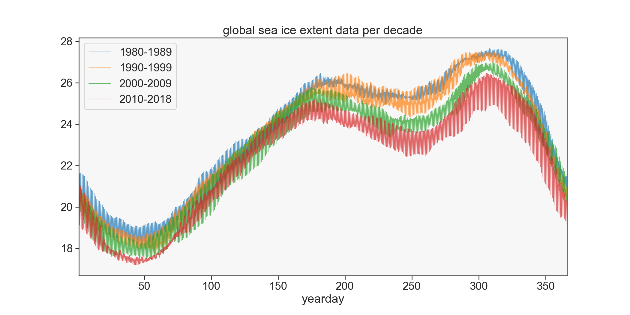
Bonus: Plot extent by decade
To show a clearer picture of the general trend in extent it’s useful to plot by decade instead. We revert to matplotlib for this as it’s easier for me to do quickly. This is done by splitting the data into groups by decade and then grouping each sub dataframe by yearday and aggregating by mean. Since the yeardays are given with different fractions in some years the data doesn’t line up exactly so it actually gives a spread over each decade.
df=pd.read_csv('seaice_extent_cleaned.csv',index_col=0).dropna()
decades = [range(1980,1990),range(1990,2000),range(2000,2010),range(2010,2019)]
fig,axs=plt.subplots(1,1,figsize=(14,7))
for dec in decades:
    sub = df[df.year.isin(dec)]
    x = sub.groupby('yearday').agg({'extent':np.mean}).reset_index()
    x.plot(y='extent',x='yearday',lw=1.,ax=axs,label='%s-%s'%(dec[0],dec[-1]),alpha=.7)
plt.title('global sea ice extent data per decade')
View the notebook in Binder: