Ireland deaths in 2019/2020 compared to previous years
Background
In a previous post we looked at Ireland daily deaths data from 2019/2020 from RIP.ie. Here we can compare those two recent years to monthly data from the CSO for the years 2005-2018. This data is found here. Here we use CSO monthly figures up to 2018 and combine them with the data taken from the RIP.ie website for 2019 and 2020. The Jupyter notebook with this code is available here. The data files referred to in the code are in the same repository folder as the notebook.
#combine the two tables
rip = pd.read_csv('rip_deaths_monthly.csv')
rm = rip.melt('month',var_name='year',value_name='deaths')
rm['month_name'] = rm.month.apply(lambda x: datetime.datetime.strptime(str(x), "%m").strftime('%B'))
rm['year'] = rm.year.astype(int)
cso = pd.read_csv('cso_deaths_monthly.csv')
cso['month'] = cso.month_name.apply(lambda x: datetime.datetime.strptime(x[:3], "%b").month)
#add rip data
cso = pd.concat([cso,rm]).dropna(subset=['deaths'])

#combine with pop data to get deaths per thousand
pop = pd.read_csv('ireland_population.csv')
cso = cso.merge(pop,on='year').dropna()
cso['deathsperthousand'] = (cso.deaths/cso['pop'])*1000
cso
Totals
Total deaths increase year on year since population increases (shown below). Therefore any direct comparison between years has to take account of this.
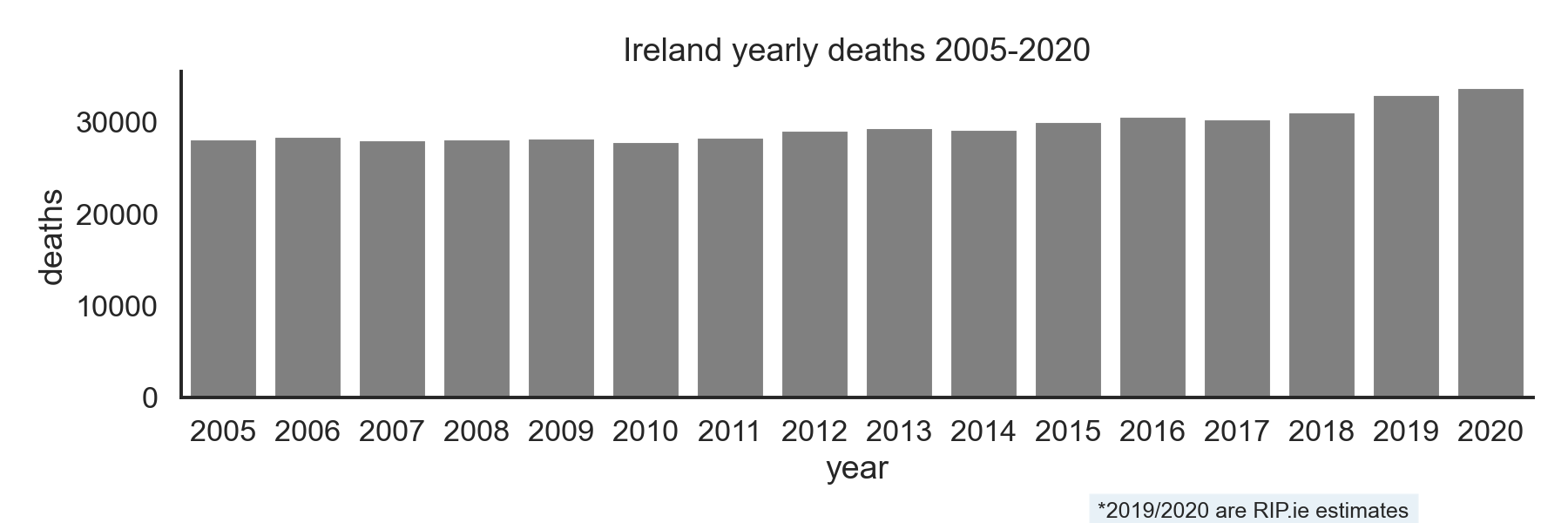
Yearly deaths from 2005-2018.
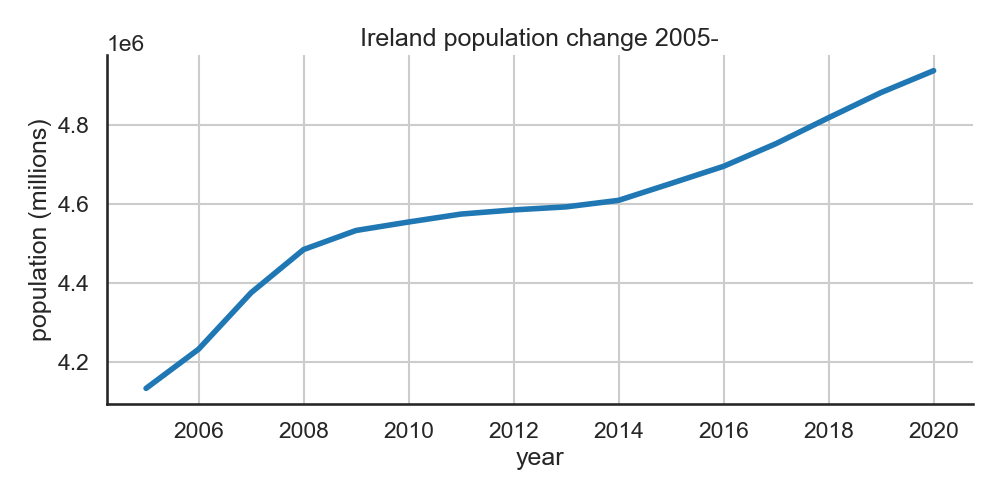
Population increase since 2005.
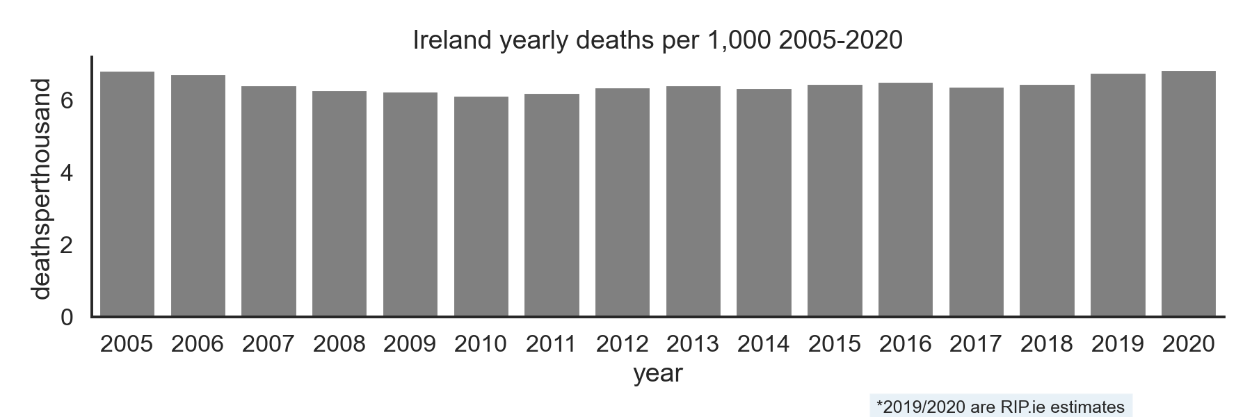
Now we adjust for population increase by calculating the deaths per 1,000 people and get a more realistic comparison. This is still crude because it doesn’t take into account the change in age profile. I used a mix of population data from the cso and some data from worldometer. Some years are estimates.
Or viewed as a boxplot with the distrubution of monthly values every year:

 f,ax=plt.subplots(figsize=(12,4))
 sns.barplot(data=cso,x='year',y='deaths',ax=ax,color='gray',ci=None,estimator=sum)
 plt.title('Ireland yearly deaths 2005-2020')
 sns.despine()
 plt.figtext(0.7, 0.01, "*2019/2020 are RIP.ie estimates", fontsize=12, bbox={"alpha":0.1,"pad":5})
 plt.tight_layout()
 plt.savefig('ireland_deaths_cso_byyear.png',dpi=150)

 f,ax=plt.subplots(figsize=(12,4))
 sns.barplot(data=cso,x='year',y='deathsperthousand',ax=ax,color='gray',ci=None,estimator=sum)
 plt.title('Ireland yearly deaths per 1,000 2015-2020')
 sns.despine()
 plt.figtext(0.7, 0.01, "*2019/2020 are RIP.ie estimates", fontsize=12, bbox={"alpha":0.1,"pad":5})
 plt.tight_layout()
 plt.savefig('ireland_deathsperthousand_cso_byyear.png',dpi=150)
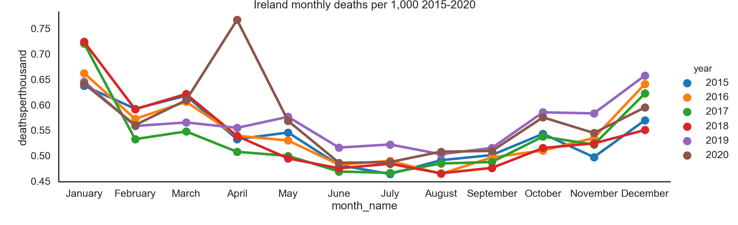
Monthly deaths since 2015
Individual years are shown below tracked per month. More recent years are most relevant for comparison so only 2015- is shown.
Monthly trend in deaths from 2012-2015.
The two RIP.ie years can be plotted against the mean value for the previous ones:

Mean trend from 2005-2018 shown in green.
x = cso[cso.year>=2015]
sns.catplot(data=x,x='month_name',y='deathsperthousand',kind='point',aspect=3,hue='year')
plt.title('Ireland monthly deaths per 1,000 2015-2020')
plt.savefig('ireland_deaths_cso_bymonth.png',dpi=150)

x=cso[(cso.year<2019) & (cso.year>=2005)]
x2 = cso[cso.year>=2019]
#fig, ax = plt.subplots(1,1)
fg=sns.catplot(data=x2,x='month_name',y='deathsperthousand',kind='point',hue='year',aspect=3,legend=False)
ax=sns.lineplot(data=x,x='month_name',y='deathsperthousand',color='g',sort=False,legend=False,ax=fg.ax)
l = plt.plot(0.5,0.5,color='g') # get a line handle
handles,labels = fg.axes.flat[0].get_legend_handles_labels()
handles.append(l[0])
fg.fig.legend(handles,["2019","2020","mean 2005-18"])
plt.savefig('ireland_deaths_cso_meantrend.png',dpi=150)
Heatmap
An overall view of the monthly values shown in a heatmap:
