Daily deaths in Ireland from RIP.ie in 2019 and 2020
Background
See updated analyses here and here.
Deaths in Ireland must be registered by law and are held in the General Register Office (GRO) which is the central civil repository for records relating to Births, Marriages and Deaths. A death can be registered with any Registrar, irrespective of where it occurs. Deaths must be registered as soon as possible after the death and no later than three months. So there is a delay of a few months before death figures can be considered completely accurate. In any case if we want to get trends in daily mortality we cannot get this from the GRO. The next best thing is to use data posted publicly on the RIP.ie website. This is a private service used by undertakers who upload the deaths in a more timely manner than official registrations and is considered a reliable substitute. This has actually been described by the CSO who give a good description of the rationale for using the RIP.ie data, quoted here:
Funeral directors have a secure login and can post a notice without cost on the website. Only funeral directors can post a notice, ensuring the data is of good quality and duplicates are rare. Due to the Irish custom of holding funerals within two to three days following death, these notices are usually placed in a fast and efficient manner. The combination of these market and cultural forces have made RIP.ie a valuable crowd-sourced means of tracking deaths. These notices are close to 'real time' - the average length of time between date of death and publication is about 1.1 days.
Method
Here I use the method of the CSO to fetch RIP.ie data and make some summary plots. Unfortunately this requires copying the data manually from the search results tables which is a bit tedious. I did not scrape the website, which might be frowned upon by those running it in any case. The rows were put in a spreadsheet and saved to a csv file with some removal of spaces. The csv file was imported into a pandas DataFrame using the ‘Latin-1’ encoding to deal with some unusual symbols. The table was cleaned by removing empty rows. The entries were then de-duplicated by removing all duplicates of the same name on a given date. The same person will often have multiple entries to indicate their other residences. This duplication removal might result in two different individuals with the same name being removed by mistake but this should be minor. Gender of the individuals were found by parsing the first names and looking up a list of known Irish female names to categorise them. Again, this will introduce a small amount of error as it’s not a 100% exact processs. But it appears to be generally reliable. The Jupyter notebook with this code is available here.
import pandas as pd
import pylab as plt
import numpy as np
import seaborn as sns
import matplotlib as mpl
import pylab as plt
import matplotlib.dates as mdates
sns.set_context('talk')
pd.set_option('display.width', 150)
locator = mdates.AutoDateLocator(minticks=4, maxticks=10)
formatter = mdates.ConciseDateFormatter(locator)
import geopandas as gpd
sns.set_style("white")

raw = pd.read_csv('ripie.csv',encoding='Latin-1')
raw = raw.drop_duplicates(subset=['date','name'])
#parse the dates
raw['date'] = pd.to_datetime(raw.date,format='%d/%m/%y',errors='coerce')
raw = raw[~raw.date.isnull()]
raw = raw.sort_values('date')
#get date features
raw['year'] = raw.date.dt.year
raw['month'] = raw.date.dt.month
raw['day'] = raw.date.dt.dayofyear
The first question we can answer is were total deaths in 2020 significantly different to other years? This data shows that there were 33,123 deaths in 2019 and 33,842 in 2020. So about 700 more deaths. Probably much of this is accounted for by the pandemic but also total deaths increase every year with population.
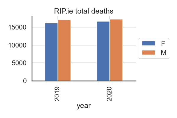
Total deaths in 2019 and 2020 from RIP.ie.
Deaths trend with seasonal cycles
The entire period can be plotted with the Winter increases visible plus the unusual peak in April.
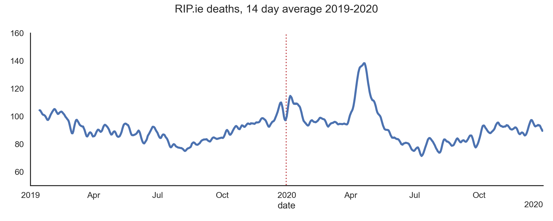
14 day trailing average for daily deaths in 2019 and 2020 from RIP.ie.
x = raw.groupby('date').size()
ax=x.rolling(14,win_type='hamming').mean().plot(lw=4,figsize=(15,6),ylim=(50,160))
ax.xaxis.set_major_locator(locator)
ax.xaxis.set_major_formatter(formatter)
plt.suptitle('RIP.ie deaths, 14 day average 2019-2020')
sns.despine()
plt.tight_layout()
plt.savefig('ireland_deaths_ripie_trend.png',dpi=150)
By month

Monthly totals compared.
bymonth = pd.pivot_table(raw, index='month',columns='year',values='name',aggfunc='size')
bymonth.plot(kind='bar',figsize=(12,6))
plt.suptitle('RIP.ie deaths by month 2019,2020')
sns.despine()
plt.savefig('ireland_deaths_ripie_bymonth.png',dpi=150)
Years compared
We can pivot the data to get it into a form where the data can be plotted by year on seperate axes. To do this we use the day of the year as an index (see code if interested). The plot below shows how noisy the daily data is as deaths vary greatly during each week around an average. The spikes you can see are around each weekend.
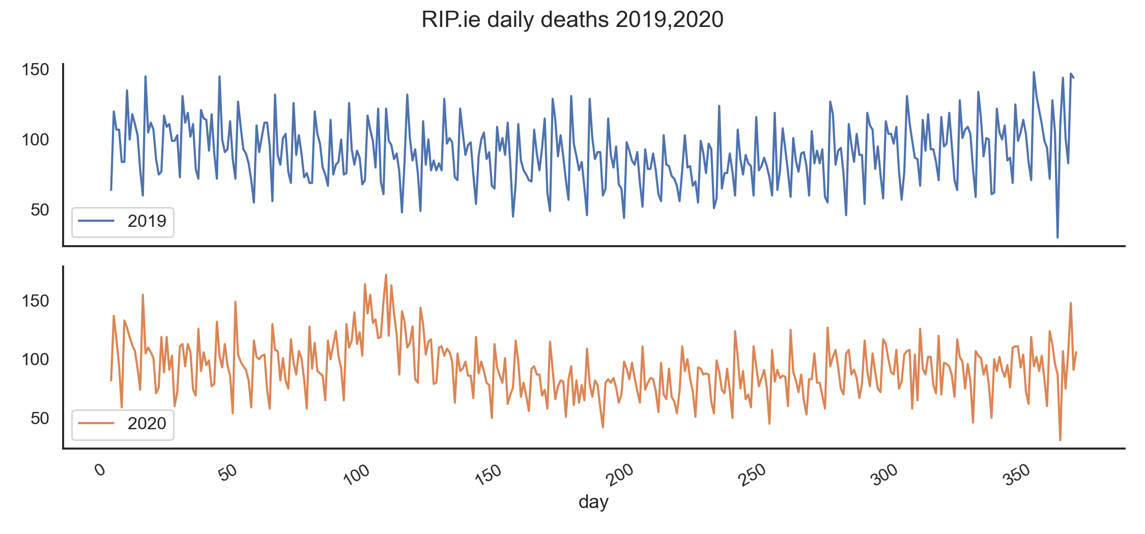
Raw data.
To get a better visual comparison we need to average out, or smooth, the data over a given period. This is done here with a rolling average (trailing) over 14 days. Now we see the difference between each year on average for much better. The April 2020 peak is the Covid-19 pandemic and is very obvious. Averages are useful but be careful when using the absolute values on the y-axis. This plot also shows that deaths in June/July were lower than the previous year. This could be because of the April excess.
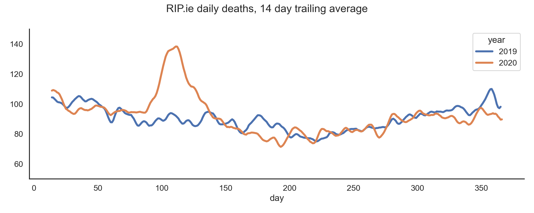
Trailing averages compared.
byday = pd.pivot_table(raw, index='day',columns='year',values='name',aggfunc='size')
ax=byday.plot(figsize=(15,7),lw=1.5,subplots=True)
sns.despine()
plt.suptitle('RIP.ie deaths 2019,2020')
plt.tight_layout()
meanday = byday.rolling(window=14,win_type='hamming').mean()
meanday.plot(figsize=(15,6),ylim=(50,150),lw=4)
sns.despine()
plt.suptitle('RIP.ie deaths, 14 day trailing average')
plt.tight_layout()
Mortality data is not easy to find
The CSO has a more detailed analysis as they added place of death information. But it’s only for the period October 2019-June 2020. Daily deaths data is not made available by either the CSO or some other public body. The HSPC maintains a COVID dashboard but it only performs that narrow function. Those figures are useful but out of the context of general mortality data are only so informative. In the UK, the PHE (Public Health England) and ONS perform this function quite well. EuroMOMO shares this kind of data for most European countries and is the best general source. Though they don’t seem to share their raw data from what I can see. The CSO does have monthly deaths figures up to 2018 which we can compare to these results in a follow up post.