Choropleth maps with geopandas, Bokeh and Panel
Background
A choropleth is just a map made of polygons (shapes) representing a geographical area. The patches are coloured according to some measured value related to that region. For example you could colour each country in the world according to the average life expectancy. All you need are coordinates files and some data points to correspond with the polygon names.
Requirements
GeoPandas, Bokeh, Panel, Matplotlib can be installed with pip or conda.
Imports:
import pandas as pd
import geopandas as gpd
import json
import matplotlib as mpl
import pylab as plt

from bokeh.io import output_file, show, output_notebook, export_png
from bokeh.models import ColumnDataSource, GeoJSONDataSource, LinearColorMapper, ColorBar
from bokeh.plotting import figure
from bokeh.palettes import brewer

import panel as pn
import panel.widgets as pnw
Read Shapefile
A shapefile is an vector data storage format for storing the attributes of geographic features. It is stored as a set of related files, usually placed together in zip format. This is easily read in Geopandas. Here we use a shapefile from naturalearthdata for all the countries in the world. It’s read in to a DataFrame like structure and the columns renamed.
shapefile = 'data/ne_110m_admin_0_countries.shp'
#Read shapefile using Geopandas
gdf = gpd.read_file(shapefile)[['ADMIN', 'ADM0_A3', 'geometry']]
#Rename columns.
gdf.columns = ['country', 'country_code', 'geometry']
gdf = gdf.drop(gdf.index[159])
Fetch data
For this example we use the datasets from ourworldindata who store their datasets in a semi-standardized csv format on github. This means we can fetch the data based on a dataset name, which we will use later for an interactive map. This function takes a label and checks the url from a table and downloads it into a pandas dataframe. This is then merged into the GeoDataFrame object that we created above. We also return the name of the data column which is used to plot the colors.
owid = pd.read_csv('data/owid.csv').set_index('name')
def get_dataset(name,key=None,year=None):

    url = owid.loc[name].url
    df = pd.read_csv(url)
    if year is not None:
        df = df[df['Year'] == year]
    #Merge dataframes gdf and df_2016.
    if key is None:
        #name of column for plotting is always the third one
        key = df.columns[2]
    #merge with the geopandas dataframe
    merged = gdf.merge(df, left_on = 'country', right_on = 'Entity', how = 'left')
    merged[key] = merged[key].fillna(0)
    return merged, key
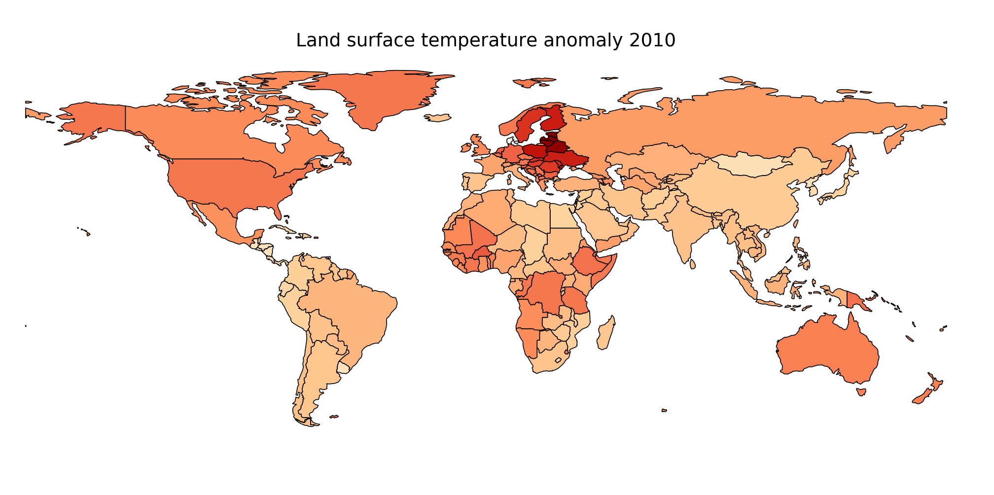
Plot with matplotlib
Geopandas objects can be plotted directly with matplotlib.
datasetname='Land surface temperature anomaly'
data,key = get_dataset(datasetname, year=2010)
fig, ax = plt.subplots(1, figsize=(14, 8))
data.plot(column=key, cmap='OrRd', linewidth=0.8, ax=ax, edgecolor='black')
ax.axis('off')
ax.set_title('%s 2010' %datasetname, fontsize=18)
Plot with bokeh
Bokeh draws maps the way it would draw any polygons. First the geodataframe (with color data column added) is converted into a GeoJSONDataSource object which autotamically makes fields called ‘xs’ and ‘ys’ with the coordinates. We then plot the values as patches.
def get_geodatasource(gdf):
    """Get getjsondatasource from geopandas object"""
    json_data = json.dumps(json.loads(gdf.to_json()))
    return GeoJSONDataSource(geojson = json_data)

def bokeh_plot_map(gdf, column=None, title=''):
    """Plot bokeh map from GeoJSONDataSource """

    geosource = get_geodatasource(gdf)
    palette = brewer['OrRd'][8]
    palette = palette[::-1]
    vals = gdf[column]
    #Instantiate LinearColorMapper that linearly maps numbers in a range, into a sequence of colors.
    color_mapper = LinearColorMapper(palette = palette, low = vals.min(), high = vals.max())
    color_bar = ColorBar(color_mapper=color_mapper, label_standoff=8, width=500, height=20,
                         location=(0,0), orientation='horizontal')

    tools = 'wheel_zoom,pan,reset'
    p = figure(title = title, plot_height=400 , plot_width=850, toolbar_location='right', tools=tools)
    p.xgrid.grid_line_color = None
    p.ygrid.grid_line_color = None
    #Add patch renderer to figure
    p.patches('xs','ys', source=geosource, fill_alpha=1, line_width=0.5, line_color='black',
              fill_color={'field' :column , 'transform': color_mapper})
    #Specify figure layout.
    p.add_layout(color_bar, 'below')
    return p
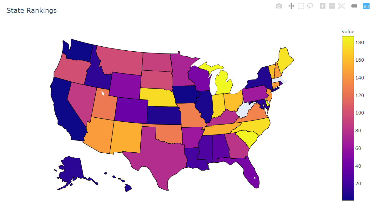
Interactive plot with panel
If we want to be able interactively choose the year or dataset we can use Panel to make a small dashboard. This uses a few datasets from OWID and a range of years. Data may not be present for all years. Obviously this could be improved a lot - for example the scale changes with year which is confusing.
def map_dash():
    """Map dashboard"""

    from bokeh.models.widgets import DataTable
    map_pane = pn.pane.Bokeh(width=400)
    data_select = pnw.Select(name='dataset',options=list(owid.index))
    year_slider = pnw.IntSlider(start=1950,end=2018,value=2010)
    def update_map(event):
        gdf,key = get_dataset(name=data_select.value,year=year_slider.value)
        map_pane.object = bokeh_plot_map(gdf, key)
        return
    year_slider.param.watch(update_map,'value')
    year_slider.param.trigger('value')
    data_select.param.watch(update_map,'value')
    app = pn.Column(pn.Row(data_select,year_slider),map_pane)
    return app

app = map_dash()

The code in a Jupyter notebook and data files can be found together here.
Links
- naturalearthdata
- Our World in Data
- OWID Dataset Collection
- GIS at UCD and on the Web: Find Spatial Data & Other Datasets for Ireland
- https://towardsdatascience.com/lets-make-a-map-using-geopandas-pandas-and-matplotlib-to-make-a-chloropleth-map-dddc31c1983d
- https://towardsdatascience.com/a-complete-guide-to-an-interactive-geographical-map-using-python-f4c5197e23e0