Visualizing Irish girls names since 1970
Background
The CSO (Central Statistics Office of Ireland) publishes a list of the baby names registered every year with number of births for each. The data goes back to 1967. So we can see which names are most popular every year and how they change over time. This post uses Python, seaborn and matplotlib to visualise the data in various ways. The code for making these plots can be shown underneath each one or the complete code viewed in the Jupyter notebook here. The data file used is also in the repository (girls_names_cso_ireland.csv).
Total births, top 20
This shows names ranked by total number of births since 1970, top 20 only.

import pandas as pd
import pylab as plt
import numpy as np
import seaborn as sns
import matplotlib as mpl
import pylab as plt

totals=girls.groupby('Name').sum()['Number of Births'].sort_values(ascending=False)
totals[:20].plot(kind='barh',figsize=(12,6))
plt.title('total births per name, top 20')
plt.savefig('girls_names_totals_top20.png',dpi=150)
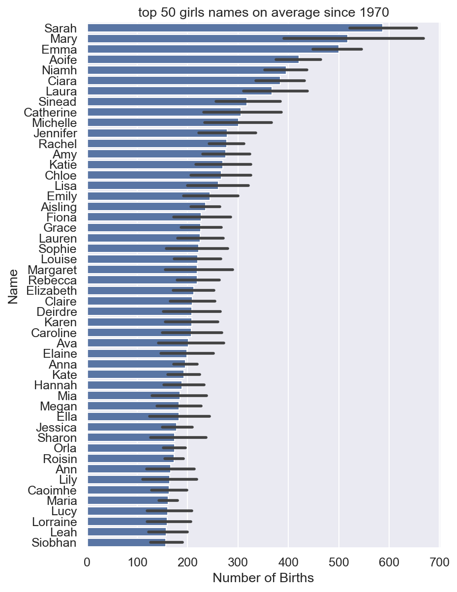
Most popular names on average since 1970
Most popular on average may not be that informative since names can come and go. This plot is the top 50 names on average since 1970. The black line at the end of each bar is the variability of the number of births. To see the top names in 2019 see last plot.
X = pd.pivot_table(girls,index='Name',columns='year',values='Number of Births')
Xs = X.reindex(X.std(1).sort_values(ascending=False).index)
Xm = X.reindex(X.mean(1).sort_values(ascending=False).index)

top50 = Xm[:50].index
m = girls[girls.Name.isin(top50)]
sns.set(font_scale=1.1)
fg=sns.catplot(data=m,y='Name',x='Number of Births',kind='bar',order=top,height=8,aspect=.9)
plt.title('top 50 girls names on average since 1970')
fg.savefig('girls_names_top50.png',dpi=150)
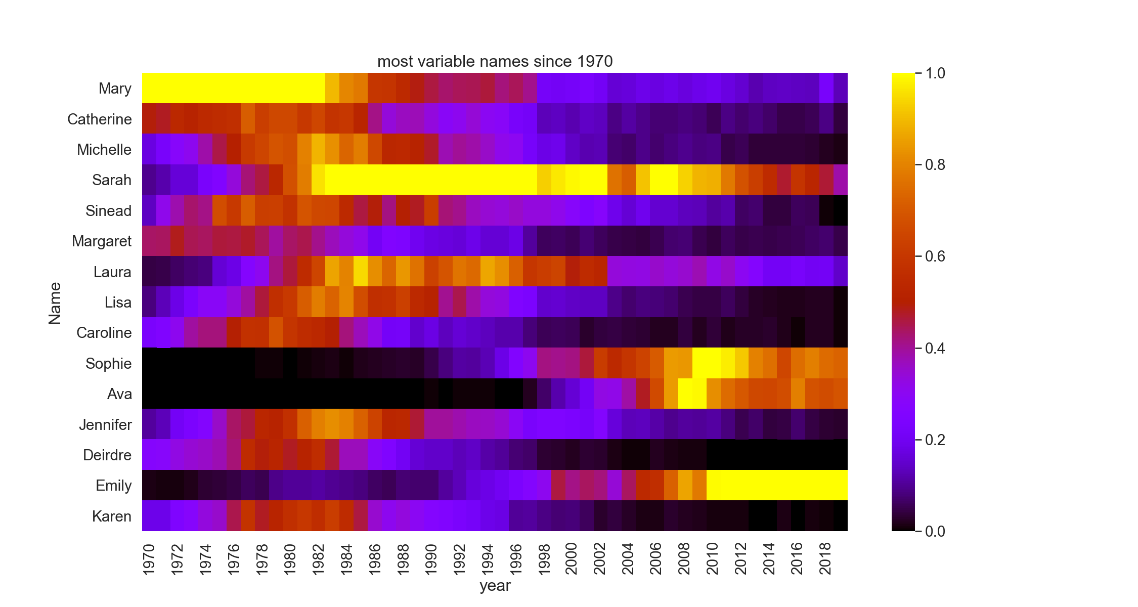
Names go in and out of fashion
It’s an obvious fact that names are subject to trends. For example we can extract the most variable names over the period by finding the standard deviation and plotting just those. One way to represent this is in a heatmap with colors representing values. Below, the bright colors are the peak values. You can see how they fade from dark to bright as the years change. The data was normalised before plotting so the values range between 0 and 1. This makes the variation in the less popular names easier to see.
sns.set(font_scale=1.3)
plt.figure(figsize=(15,8))
xnorm = (Xs-Xs.min())/(Xs.max()-Xs.min())
g=sns.heatmap(xnorm[:15],cmap='gnuplot')
g.set_facecolor('black')
plt.title('most variable names since 1970')
plt.savefig('girls_names_heatmap.png',dpi=150)
Decline of Mary, Catherine and Fiona
The above trends can be shown in another way with line plots. It shows more clearly how very popular names from the 1960s have declined almost completely. I suspect Mary will make a comeback though.

sns.set(font_scale=1.8)
top = Xm[:20].index
m = girls[girls.Name.isin(top)]
fg=sns.relplot(data=m,x='year',y='Number of Births',col='Name',col_wrap=4,
               kind='line',height=5,aspect=1.7,lw=5,facet_kws={'sharey': False})
fg.set_titles(row_template = '{row_name}', col_template = '{col_name}')
plt.savefig('girls_names_trends.png',dpi=150)
Changes over the years
We can also plot the top 10 names in selected years in each decade which is quite revealing of the trends.

fig,axs=plt.subplots(2,4,figsize=(15,10))
axs=axs.flat
i=0
for y in [1970,1980,1990,1995,2000,2010,2015,2019]:
    ax=axs[i]
    x = girls[girls.year==y]
    x = x[:10]
    #print(x[:10])
    x.plot(x='Name',y='Number of Births',kind='barh',legend=False,ax=ax,xlabel='')
    ax.xaxis.set_visible(False)
    ax.set_title(y)
    i+=1
fig.suptitle('top 10 names each decade')
plt.tight_layout()
fig.savefig('girls_names_perdecade.png',dpi=150)
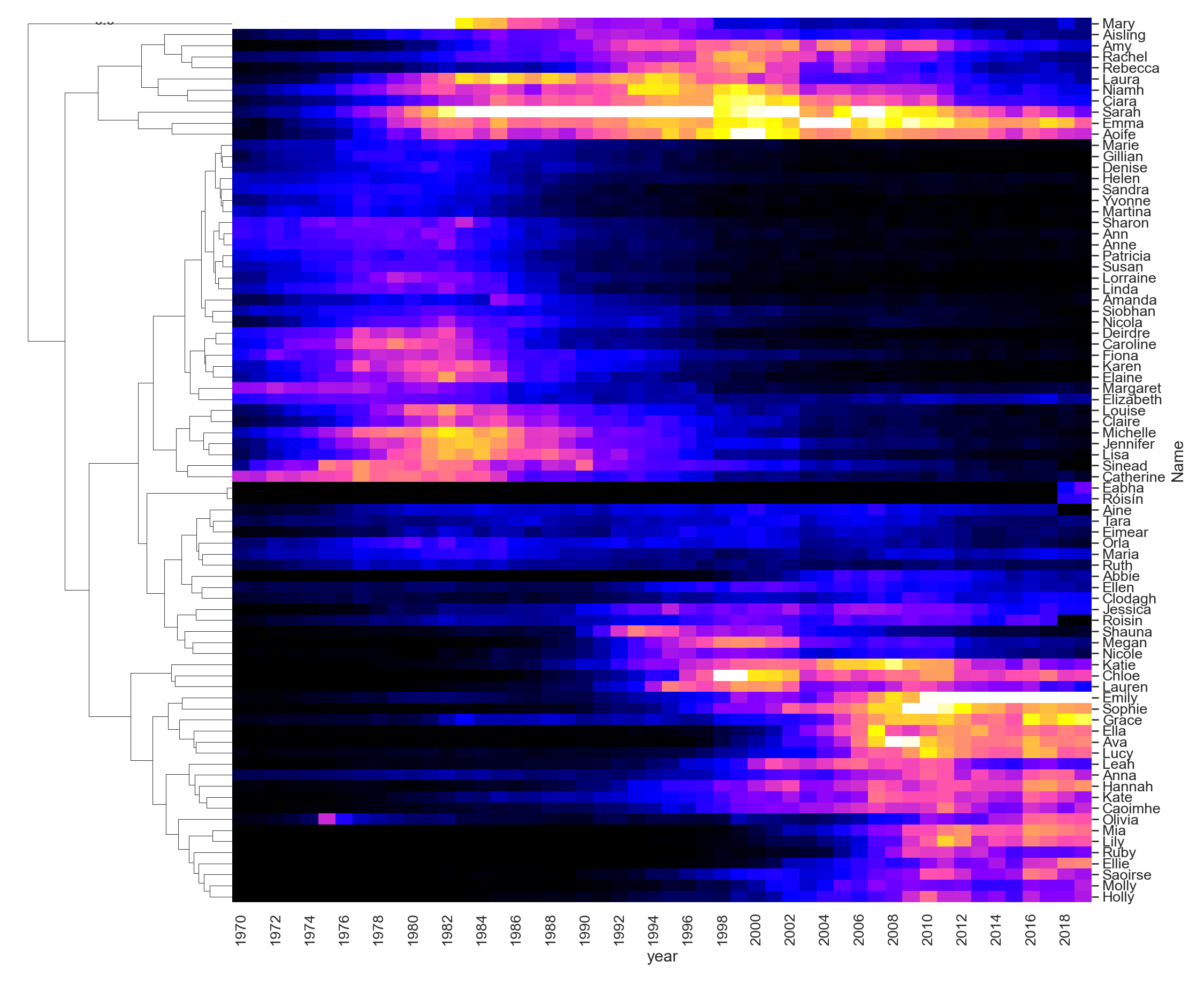
Names cluster together
Finally, we can cluster the names and see how the same kinds of names trend together at different times.
sns.set(font_scale=1.2)
plt.figure(figsize=(20,8))
xnorm = (Xm-Xm.min())/(Xm.max()-Xm.min())
xnorm =xnorm.fillna(0)
g=sns.clustermap(xnorm[:80],cmap='gnuplot2',col_cluster=False,yticklabels=True,figsize=(15,15))
plt.savefig('girls_names_clustermap_top80.png',dpi=150)
There are lots of other tidbits of information to be gleaned here. It would be possible to work out the average age of people now with a given name. Or perhaps there is a correlation between frequency of some names and the popular TV shows of the time?