Eurostat deaths from all causes dataset plots
Background
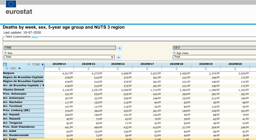
The number of deaths by week in most countries of the European Union are stored by Eurostat and accessible via their data explorer tool. This is a bit of a clunky interface but fairly straightforward to use. The data on total deaths is useful for assessing the possible effects of the COVID-19 pandemic on the European population deaths. In particular excess deaths can be estimated by comparing to the mean values over a given period. The data used here was downloaded for all years >2005 with age and sex breakdown for all available countries. The United Kingdom only starts in 2020 so is not used.
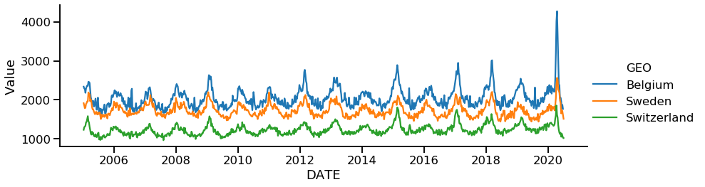
Flu season deaths create a regular cycle
The flu season accounts for a substantial amount of the cyclical changes in deaths in the Northern and Southern hemisphere. The cycle is regular and predictable. Influenza can be more severe depending on the circulating major influenzavirus subtypes. The exact mechanism behind the seasonal nature of influenza outbreaks is unknown.
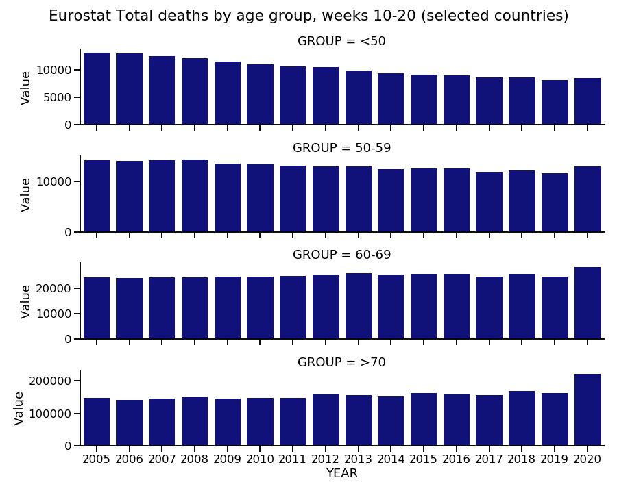
Totals per year by age group during ‘covid peak’
The spread of Covid-19 in Europe occured mostly after the flu season. If we take the ‘covid peak’ (see below) as being around weeks 10-20 of 2020, we can roughly compare the deaths for the same period each year. Remember these are total deaths, not for specific causes. The data used is only for the subset of countries with data for all years. This clearly shows the majority of the increase over other years or excess is due to the >70 age group.
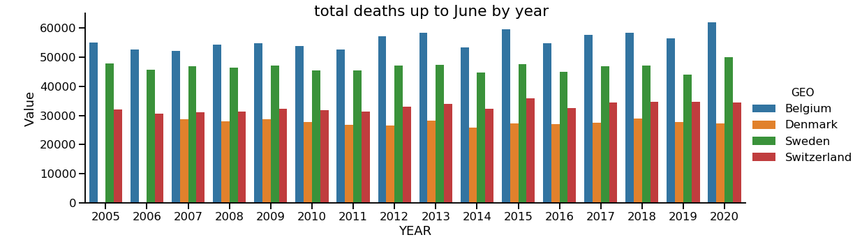
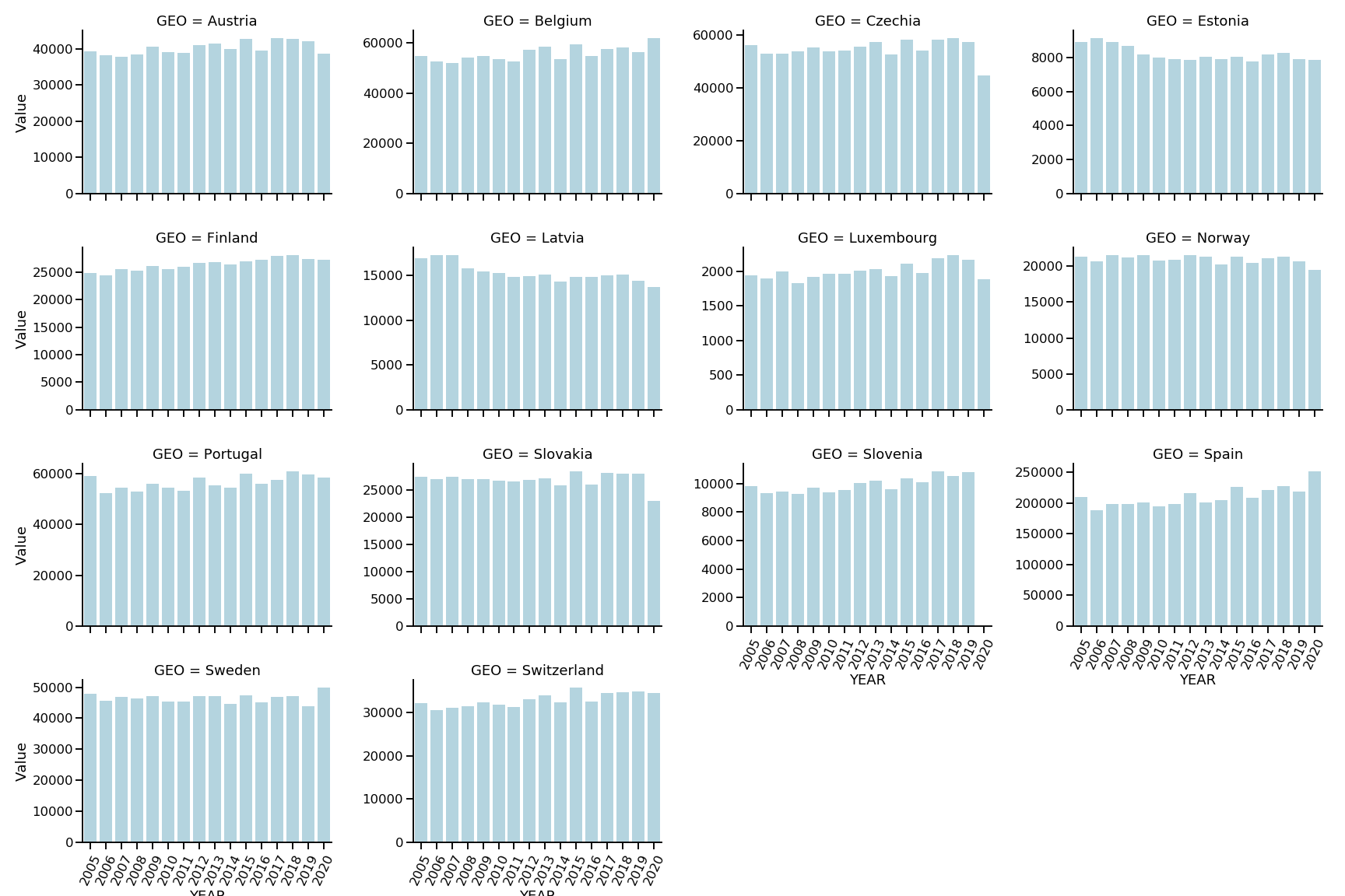
Total deaths per year up to end of June
This plot shows the totals for the first half of each year, up to June for selected countries. It is therefore a like with like comparison to 2020.
Total deaths per year up to end of June, individual plots
The same plot broken down for only countries with complete data for all years.
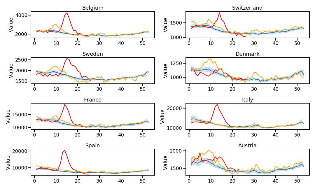
2020 weekly trend compared to mean
To compare the actual peaks during the worst covid period we simply plot the trend line for each country with a mean line for all years for reference. This kind of plot is produced by Euromomo. This shows the clear peak of deaths in older age groups from March.
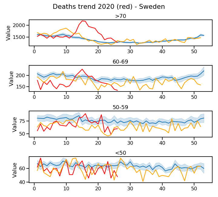
2020 weekly trend comparison by age
How do the above trends break down by age group? This is seen below for Sweden with 2020 in red and 2018 in orange.
However for Spain the peak in deaths is seen for all older age groups even at ages 50-59, though the total numbers are much smaller compared to the >70 group.
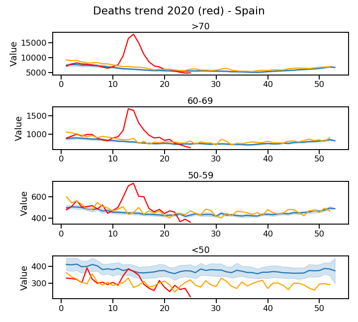
Note that the above plots do not use any covid related dataset but purely data on total deaths regardless of cause.
These plots were made using pandas and seaborn. The code can be found in a Jupyter notebook here