Interactive plots of World development indicators with Panel
Background

The World development indicators is a compilation of internationally comparable statistics about global development. The database contains 1,600 time series indicators for 217 economies and can be downloaded as a csv file. You can create visualizations of the time series data and in map form through the Open Data site. These can be shared as urls and embedded in other sites like the data below showing the shocking rise in adult mortality rates during the HIV epidemic in sub-saharan African peaking in the 1990s. The spike in death rates in Vietnam during the US invasion is shown for comparison.
This post shows how to make our own interactive dashboard using this dataset with Panel and matplotlib, covered in a previous post. The table looks like this:
Country Name   Country Code    Indicator Name                   Indicator Code  1960  ...
Afghanistan          AFG  Adjusted net enrollment rate, ...     SE.PRM.TENR.FE   NaN  ...
Afghanistan          AFG  Adjusted net enrollment rate, ...     SE.PRM.TENR.MA   NaN  ...
Afghanistan          AFG  Adjusted net national income  ...  NY.ADJ.NNTY.KD.ZG   NaN  ...
In the get_data() method we simply subset the countries and indicator to plot and then transpose the table. This puts the time series as rows with each column being the country data for that indicator. This dataframe is then readily plotted as separate series with matplotlib.
Code
import pandas as pd
import numpy as np
from matplotlib.figure import Figure
import pylab as plt
import panel as pn
from panel import widgets
pn.extension()

def plot_col(df, col, kind='line'):
    """plot a specific column"""

    fig = Figure(figsize=(10, 6))
    ax = fig.subplots()
    ax.set_title(col)
    df.plot(lw=3,ax=ax,kind=kind)
    return fig

def get_data(col,years=None,countries=None):
    """get data from the wdi dataframe"""

    x = wdi.set_index('Indicator Name')
    x = x.loc[col].set_index('Country Name')
    if countries!=None:
        x = x.loc[countries]
    x = x[x.columns[3:-2]]
    x = x.T
    x.index=x.index.astype(int)
    if years!=None:
        x = x.loc[years]
    return x
We can then make a plot for any column/indicator with this code:
col=wdi.iloc[64]['Indicator Name']
df = get_data(col)
fig=plot_col(df, col, countries=['Zimbabwe'])
To add a user interface to the plot we just use Panel widgets. This example uses the @pn.depends decorator to automatically link a function to widgets, declaring that the function should be re-run when those widget values change. Here we make a selector for indicator, a date range and country selection menu. It is a very shorthand way to make a small dashboard. (see https://panel.pyviz.org/user_guide/APIs.html)
select=pn.widgets.Select(name='indicator',options=names[:900],value=names[24])
daterange = pn.widgets.RangeSlider(name='dates', start=1961, end=2019, value=(1961,2019), step=1)
countryselect = pn.widgets.MultiSelect(name='country',options=countries,value=scountries,size=8)
typeselect = pn.widgets.Select(name='plot kind',options=['line','area'])

@pn.depends(select.param.value,daterange.param.value,countryselect.param.value,typeselect.param.value)
def update(col, years, countries, kind):
    years = range(years[0],years[1])
    df = get_data(col,years,countries)
    f = plot_col(df, col, kind)
    return f

app = pn.Row(pn.Column(select,countryselect,daterange,typeselect), update)
app
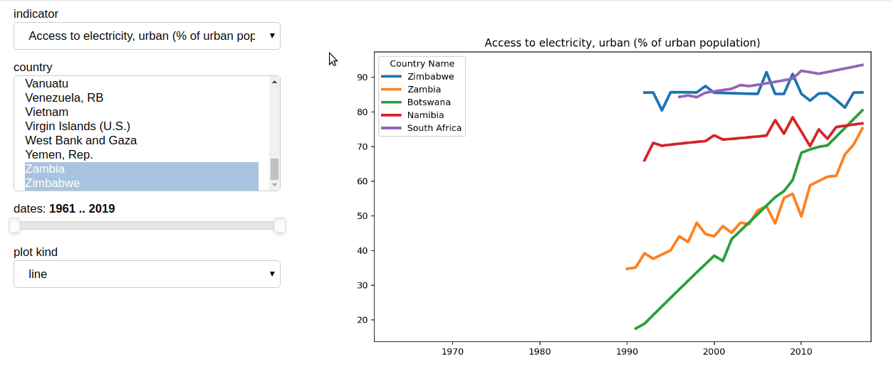
The dashboard now looks like the example below:
You can run this code yourself in a Jupyter notebook on Binder from here: